← All cases

Case study06 · Türk Telekom

Connected Telco Servicesone clear path across every digital channel

Through design thinking, we revised Türk Telekom's digital channels, each with its own independent experience. The goal was to improve the user experience, create consistency between channels and increase sales.

RoleUX designer, leading the design activities
Team3 UX designers and 2 UI designers
Duration15 weeks
PlatformResponsive website and mobile app
+35%offer applications in the first quarter after release
+40%transactions made via mobile
84%overall satisfaction rating
20in-depth user interviews behind the redesign

01

Context

The project set out to enhance the customer experience across Türk Telekom's digital channels, create consistency between them and sharpen their focus, while addressing the lack of sales on turktelekom.com.tr, improving marketing and content, and driving more traffic to digital channels.

I joined from the definition phase and took part in everything that followed, leading the design activities with two UX designers and two UI designers, and planning the production phase including workshop facilitation.
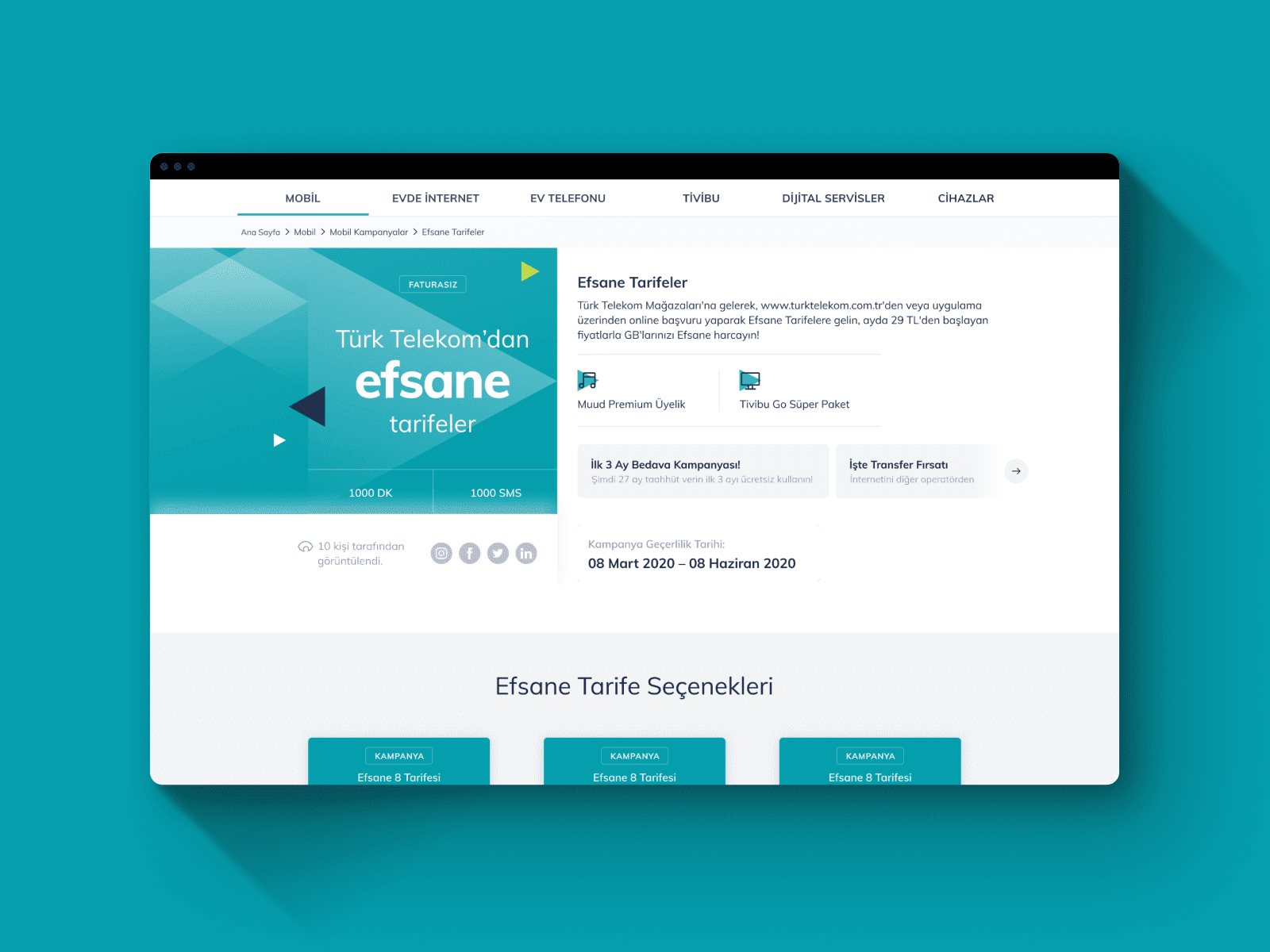
Redesigned Türk Telekom website

02

The problem

01Lost in the labyrinthInconsistent information, little guidance and a complex structure made it hard to find content or finish tasks.
02One size fits no oneGeneric recommendations flooded users with irrelevant offers that felt like a marketing ploy.
03Feeling uncared forCommunication lacked empathy and transparency, making users feel like just another number.
The goalConsistent, focused digital channels that help people find their way, get offers that fit them, and trust the brand, and that turn that experience into sales.

03

Key decisions

01

Research the business, the users and the market

The team held 16 stakeholder meetings to understand business goals, ran 20 in-depth user interviews to capture real pain points, and analysed the websites and apps of 12 competitors for best practices and room to differentiate.
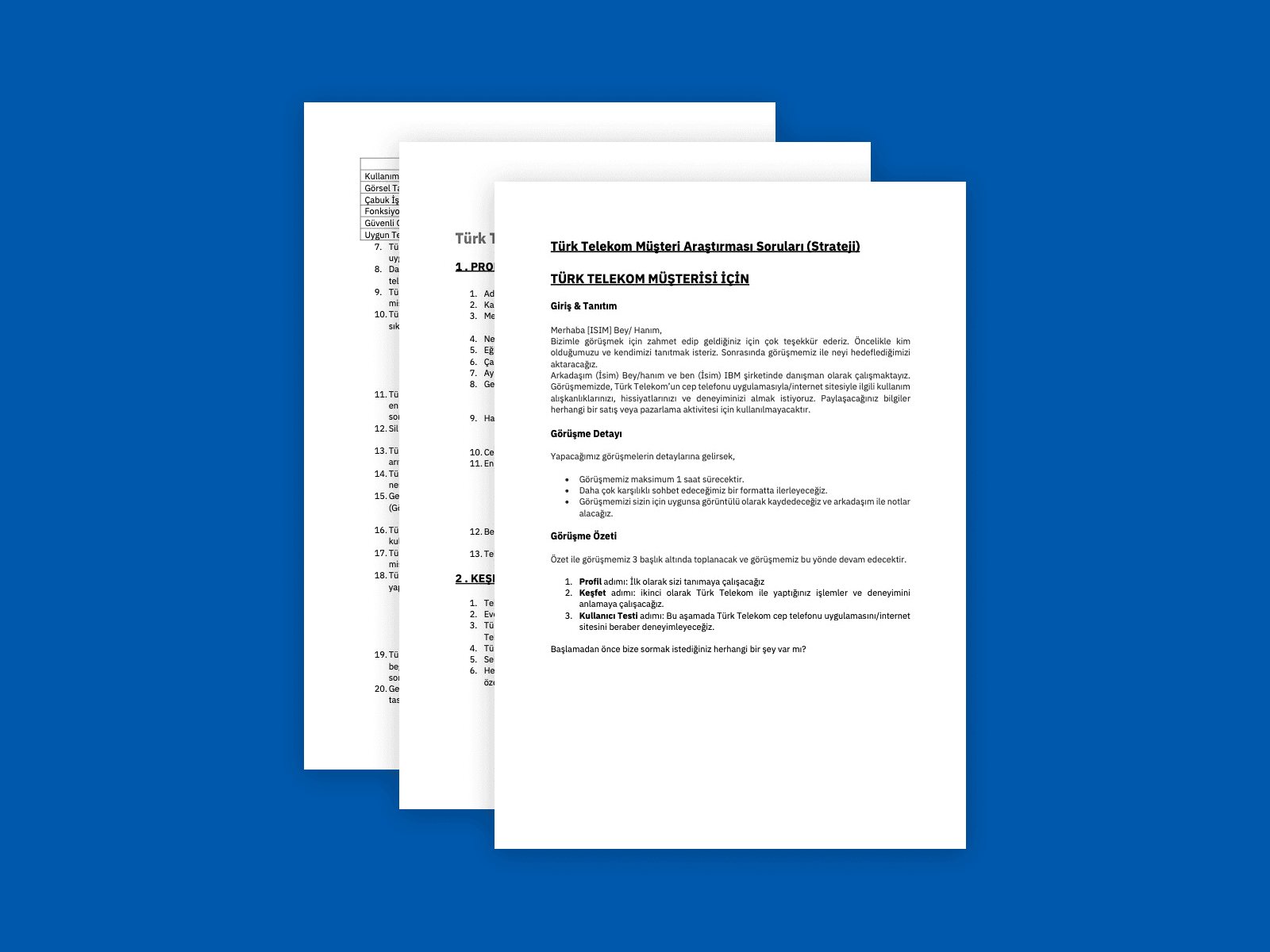
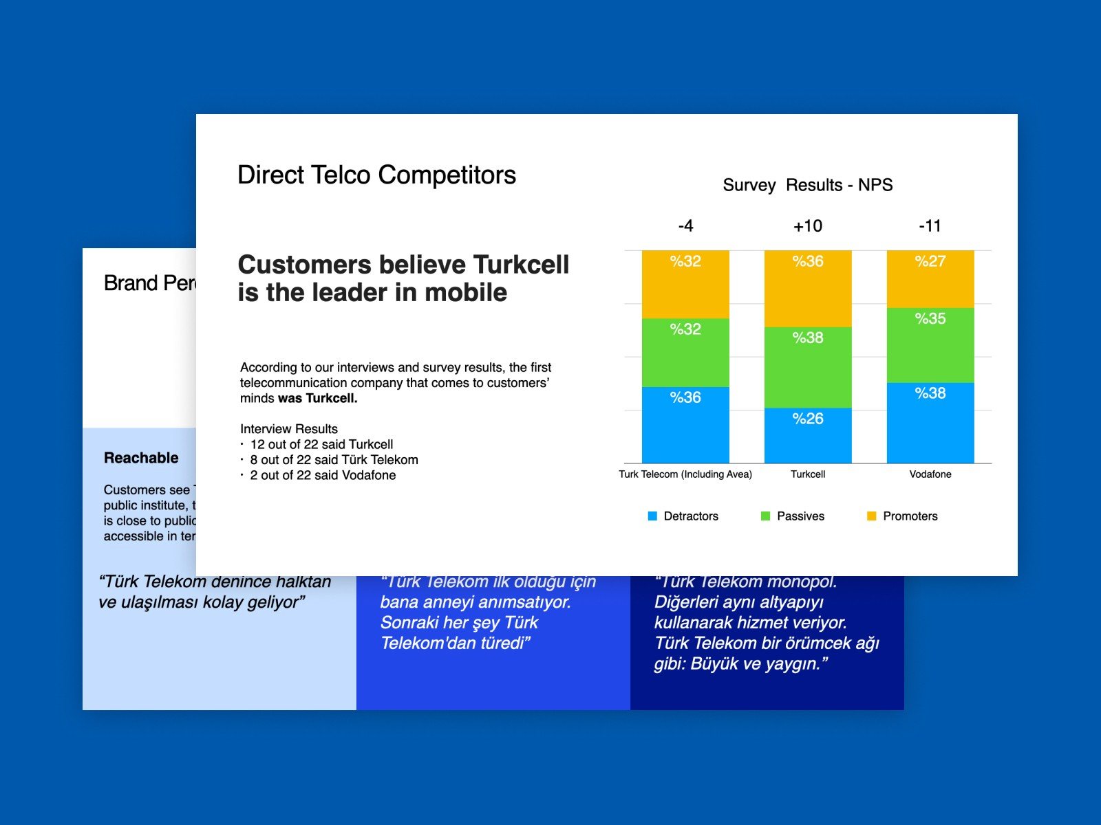
Benchmark analysisStakeholder interviewsCustomer interviewsField research
Competitive analysis
Analysing 12 competitors' websites and apps.
Survey and interview insights
Interview and survey insights on the competition.
02

Evaluate, then define together

With the UX and UI designers, I ran a heuristic evaluation of the existing website and app and compiled it into a full report. I then facilitated a one-day workshop with 24 participants that produced 4 personas and journey maps showing the key touchpoints.
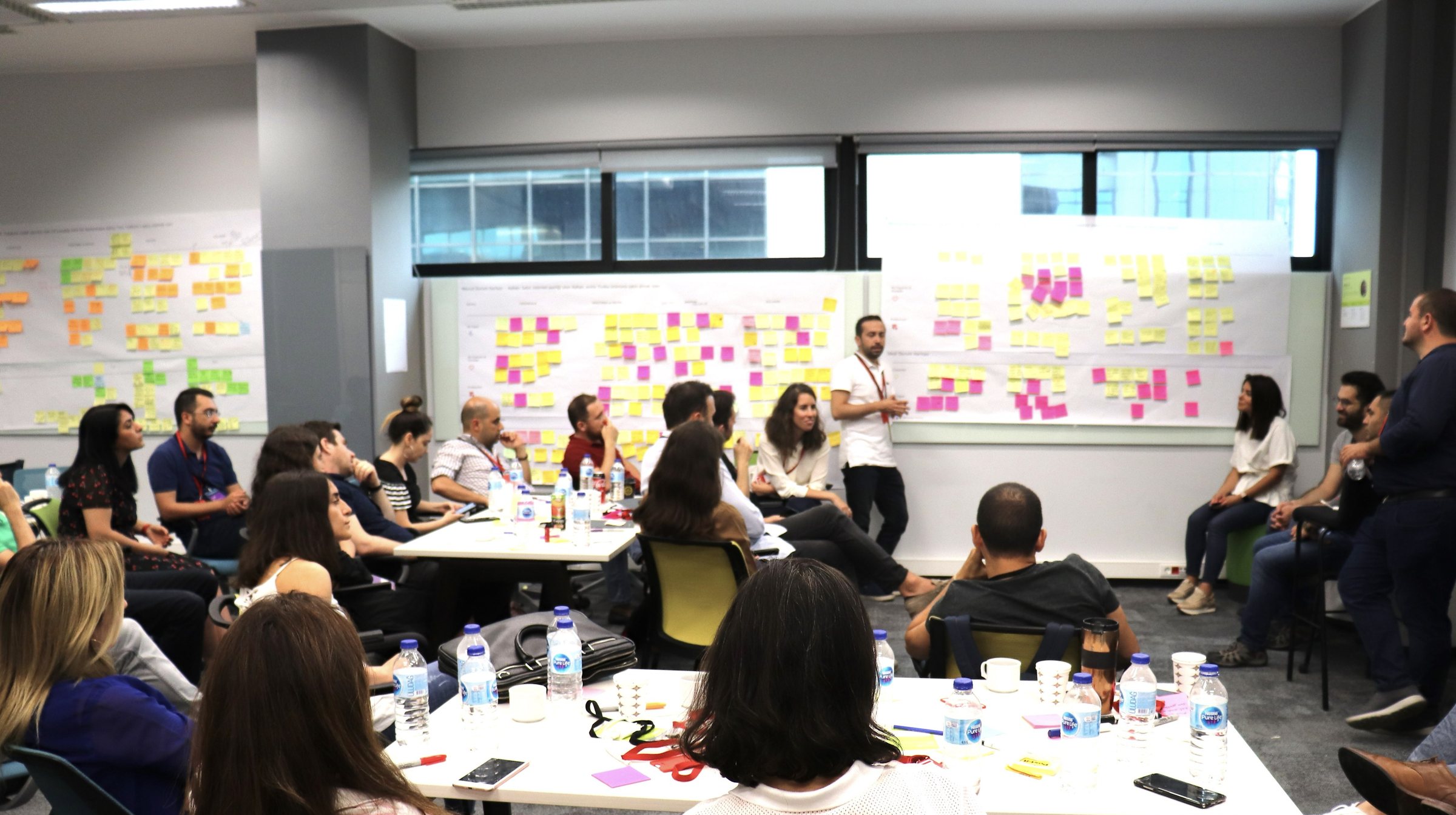
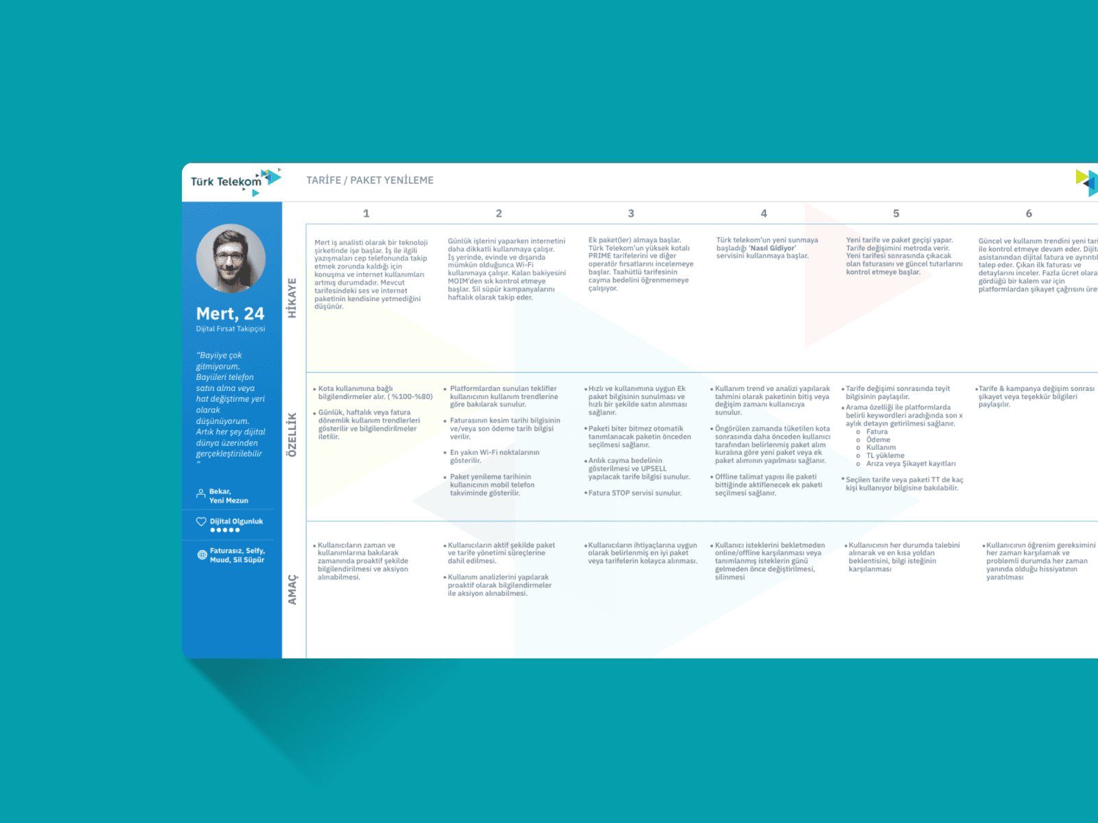
Heuristic evaluationWorkshop facilitationPersona creationCustomer journey mapsExperience pillars
Workshop with 24 participants
A one-day workshop with 24 participants.
Persona and customer journey
One of four personas with its journey.
03

Structure first, then test it with users

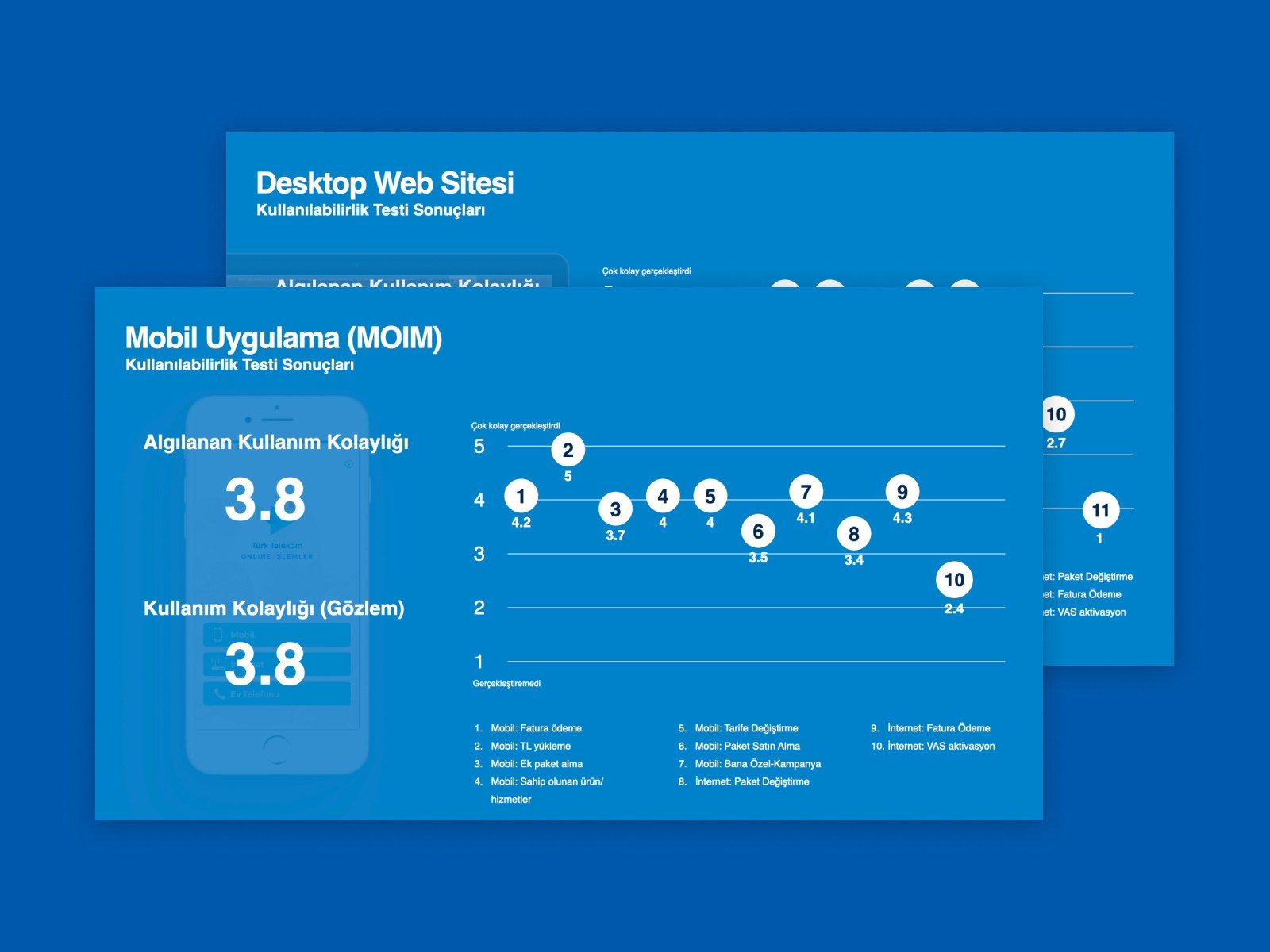
After structuring the content, I set a clear information architecture. We wireframed with the UX designers and iterated on stakeholder and user feedback, then moved to polished visual design and prototypes with the UI designers. I ran usability testing sessions to validate the decisions.
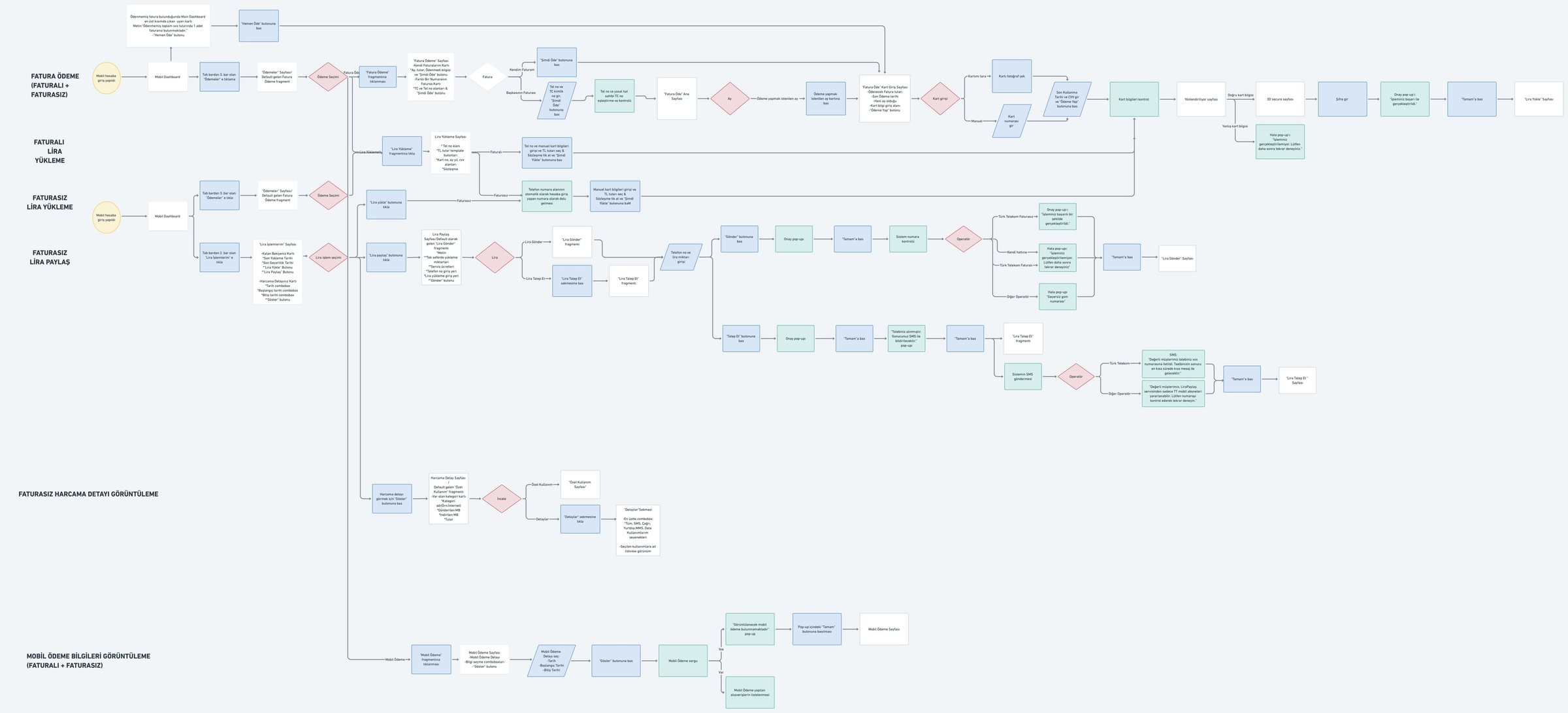
Information architectureWireframesPrototypingUsability testing
Information architecture
A clear information architecture for web and app.
Usability test results
Usability testing results for web and mobile.
04

Stay close to implementation

While the UI designers assembled a comprehensive component library, I worked closely with the development team to make sure the design was implemented faithfully.

Style guideComponent library

04

The solution

ProblemLost in the labyrinthInconsistent information, a lack of guidance and a complex structure left users confused and unable to finish tasks.
SolutionA clear path forwardConsistent information across the platform, streamlined journeys, easy main navigation, and guidance on buying or managing products built into the journey.
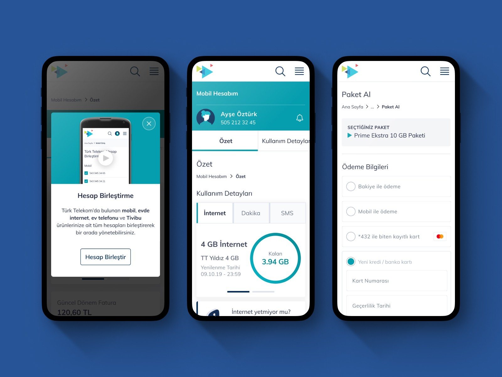
Streamlined mobile navigation
Clear navigation and guidance at every step.
ProblemOne size fits all doesn't workGeneric recommendations didn't match individual needs, and felt like marketing rather than help.
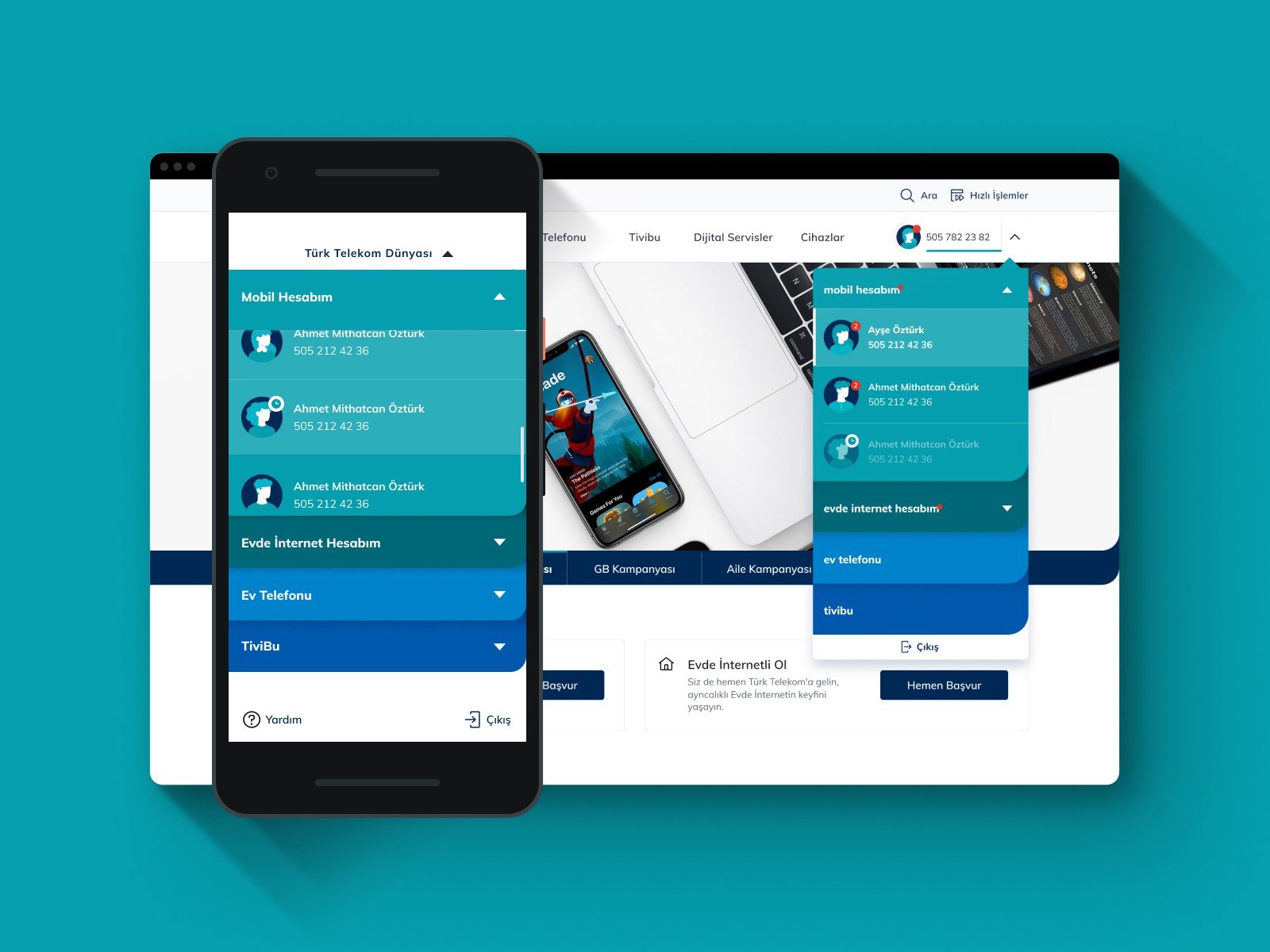
SolutionA tailored experienceMultiple and converged account management made offers and experiences personal, let users customise their platform, and made switching between products and accounts effortless.
Personalised offers across devices
Personalised offers and seamless account switching.
ProblemFeeling uncared forPrevious communication lacked empathy and transparency, making users feel like just another number.
SolutionBuilding trust through transparencyClarity over pure business interest: timely notifications, genuinely useful offers, clear communication guidelines, and full control over settings and preferences.
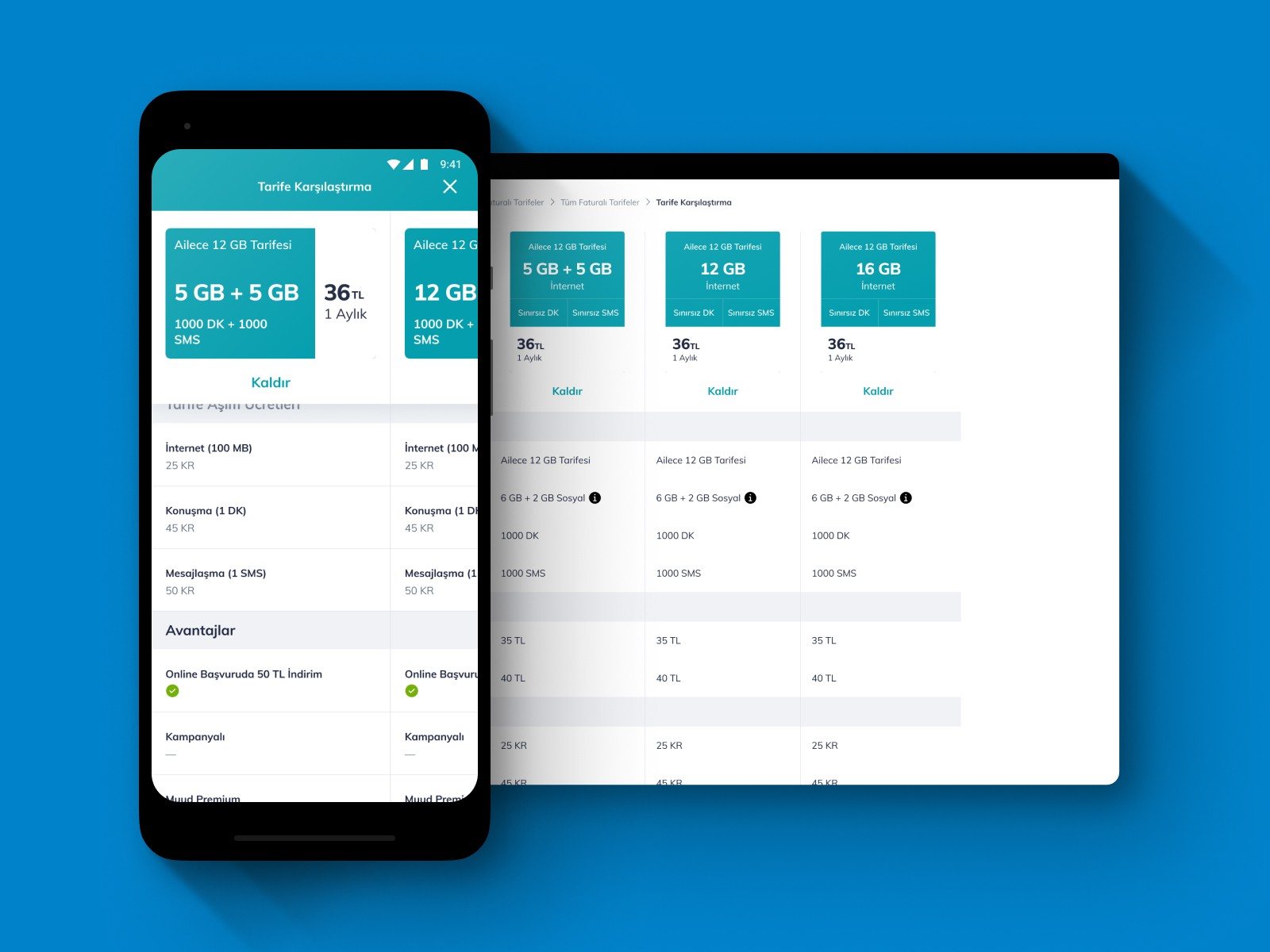
Tariff comparison on mobile and tablet
Transparent, comparable offers on every screen size.

05

Impact

Within the first quarter after release, the improved offering process led to a 35% increase in applications, and the new responsive design drove a 40% increase in mobile transactions.

+35%offer applications
+40%mobile transactions
84%overall satisfaction rating

06

Takeaways

01

Consistency is a feature

Presenting information the same way everywhere did more for findability than any single new screen.

02

Relevance beats volume

Fewer, better-matched offers earned more applications than showing everything to everyone.

03

Trust is designed

Transparency and control are design decisions, and users notice when they're missing.

Next case · 07
Car Leasing