
Case study05 · QNB Finansbank
Digital Banking Experiencea mobile-first bank, built around its customers
With a user-centred approach, we revamped the existing mobile applications by analysing and reshaping the entire digital banking experience. The redesign put customer needs ahead of product offerings and made mobile the primary channel.
01
Context
The bank set out to reshape its digital presence by prioritising customer needs over product offerings, making mobile the primary channel and focusing on user satisfaction.
The goal was to become a top competitor in digital banking by migrating customers to a new, user-friendly digital platform. Leading the UX/UI efforts, I oversaw the design and delivery of all major deliverables, planned the design activities and presented the final design to the client.
02
The problem
Research surfaced three gaps between the existing app and what digital-first customers expected.
The goalPut customer needs before product offerings, make mobile the primary channel, and migrate customers to a platform they actually want to use.
03
Key decisions
Listen to executives, users and the data
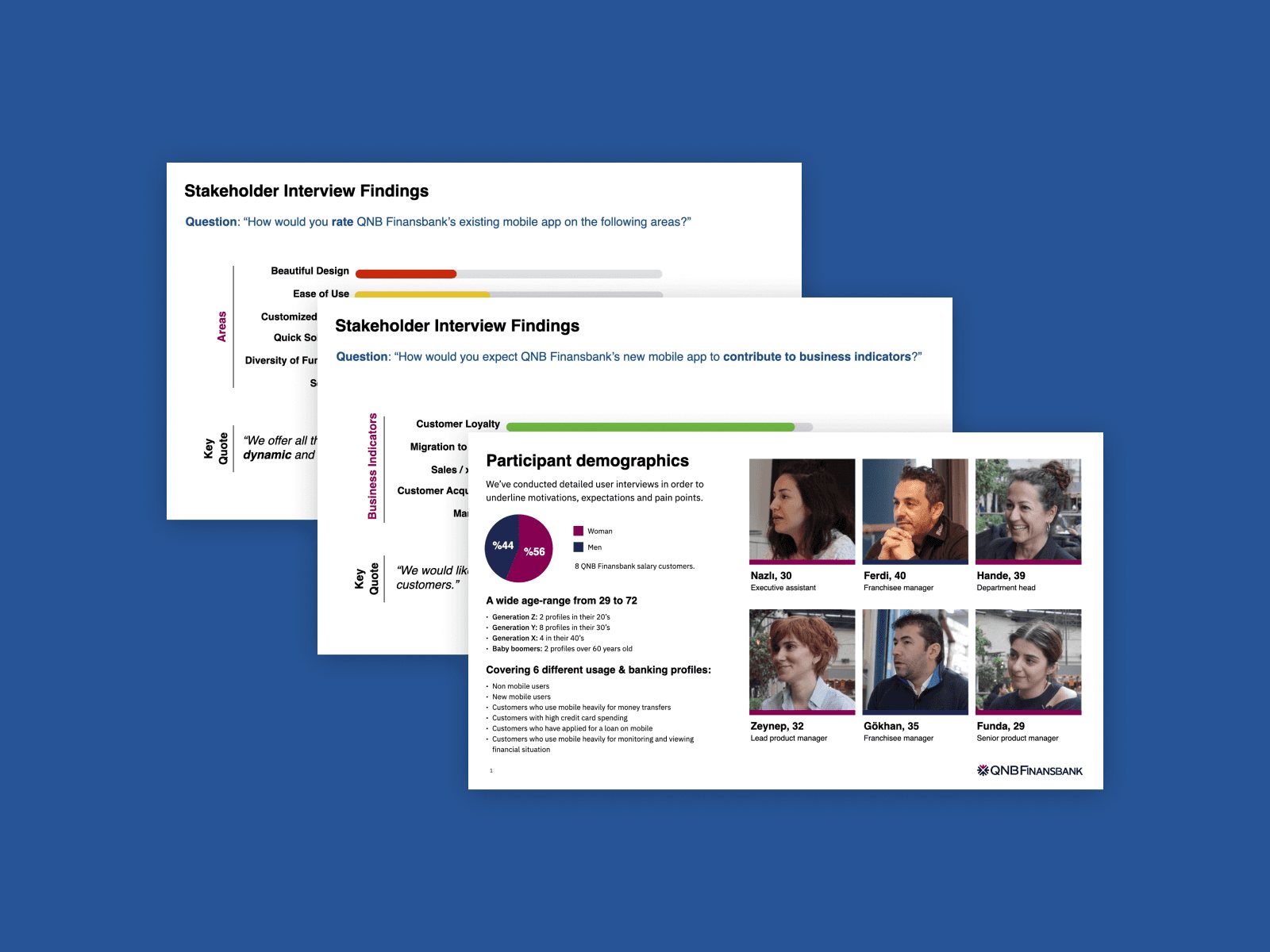
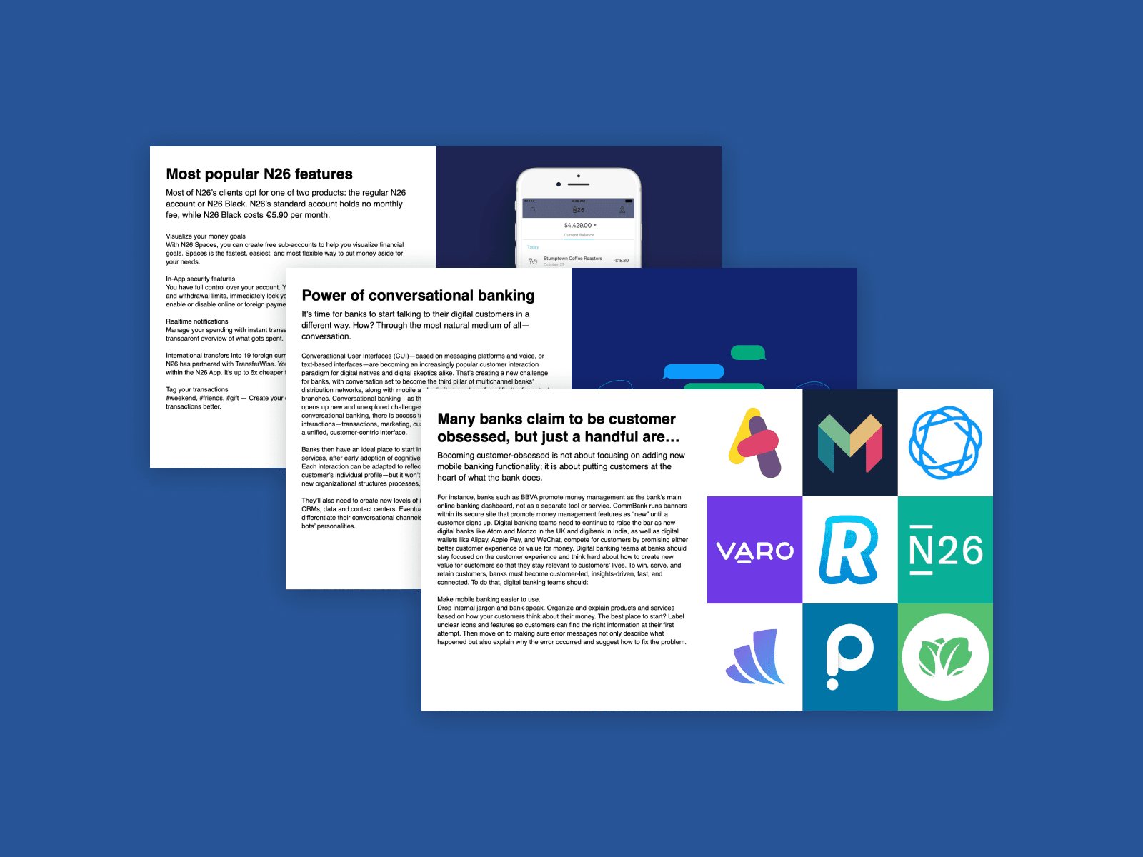
After desktop research on trends and benchmarks, I arranged face-to-face meetings with 15 executives across 7 departments and ran user interviews with the UX designers. We analysed app data and online feedback, and I evaluated the app against Nielsen's 10 usability heuristics in a full report.
Build the direction together with the client
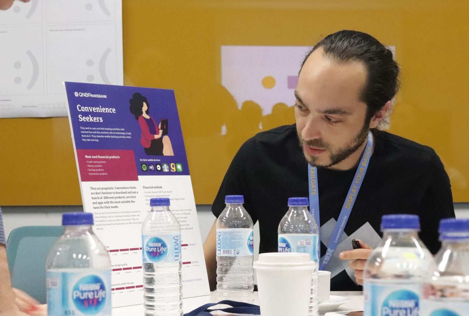
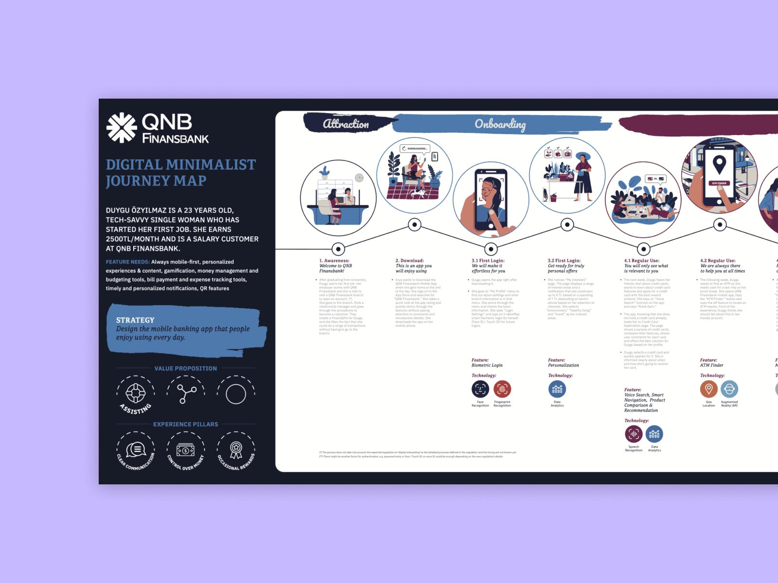
I facilitated a one-day design thinking workshop with 30+ participants. Sharing our methods from the start built trust; together we created personas, as-is and to-be journey maps and value proposition canvases. From the outcomes, the design leads and experience strategist defined the core problems and experience pillars.
Test the key flows with real users
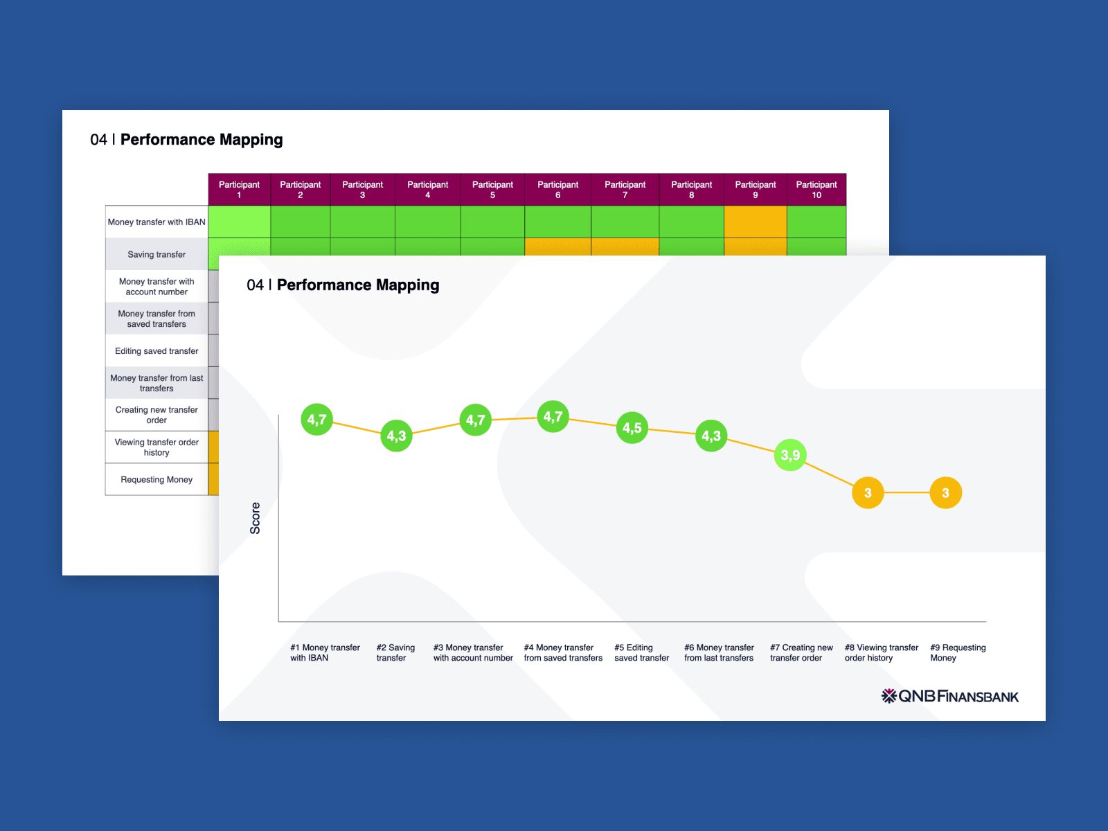
The UX designers defined the information architecture for each major flow and I designed the wireframes for the key transaction flows. We prototyped them, I tested them with real users performing tasks, and the resulting performance mapping drove the next round of improvements.
Stay with the build, hand over a system
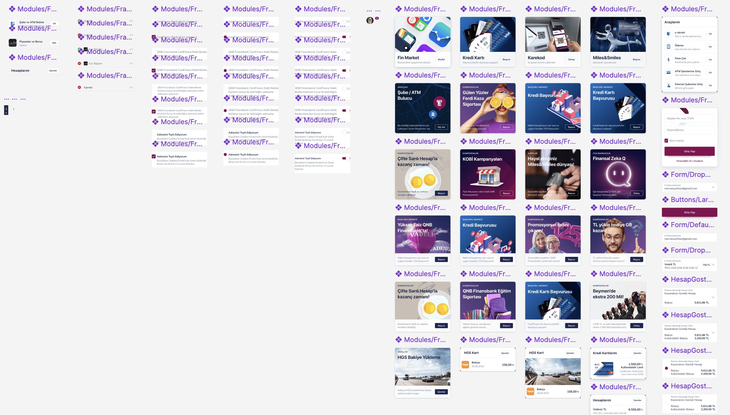
I worked closely with development through regular check-ins, using prototypes to surface challenges before production. I designed the initial components and set key foundations (brand colours, type sizes, spacing), while our visual designer assembled a component library delivered with a comprehensive guideline.
04
The solution
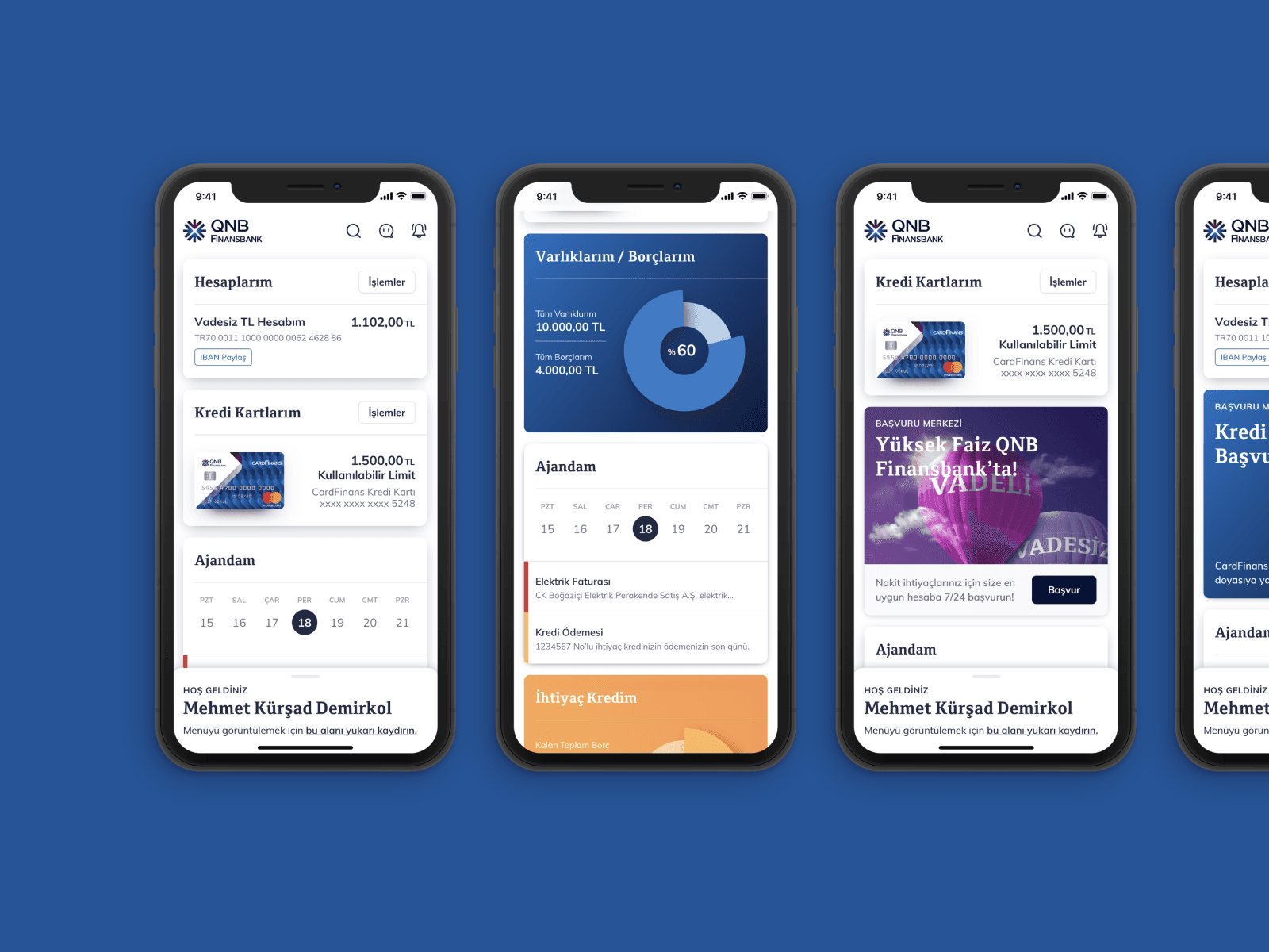
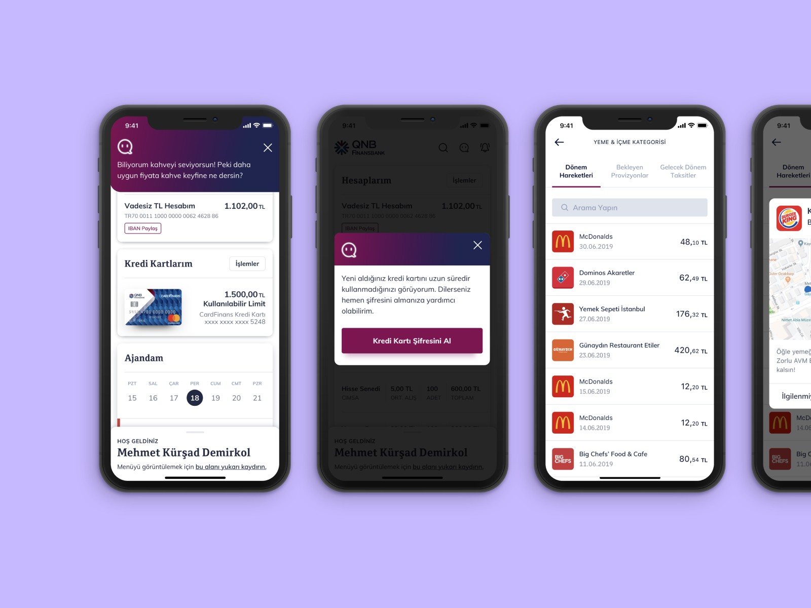
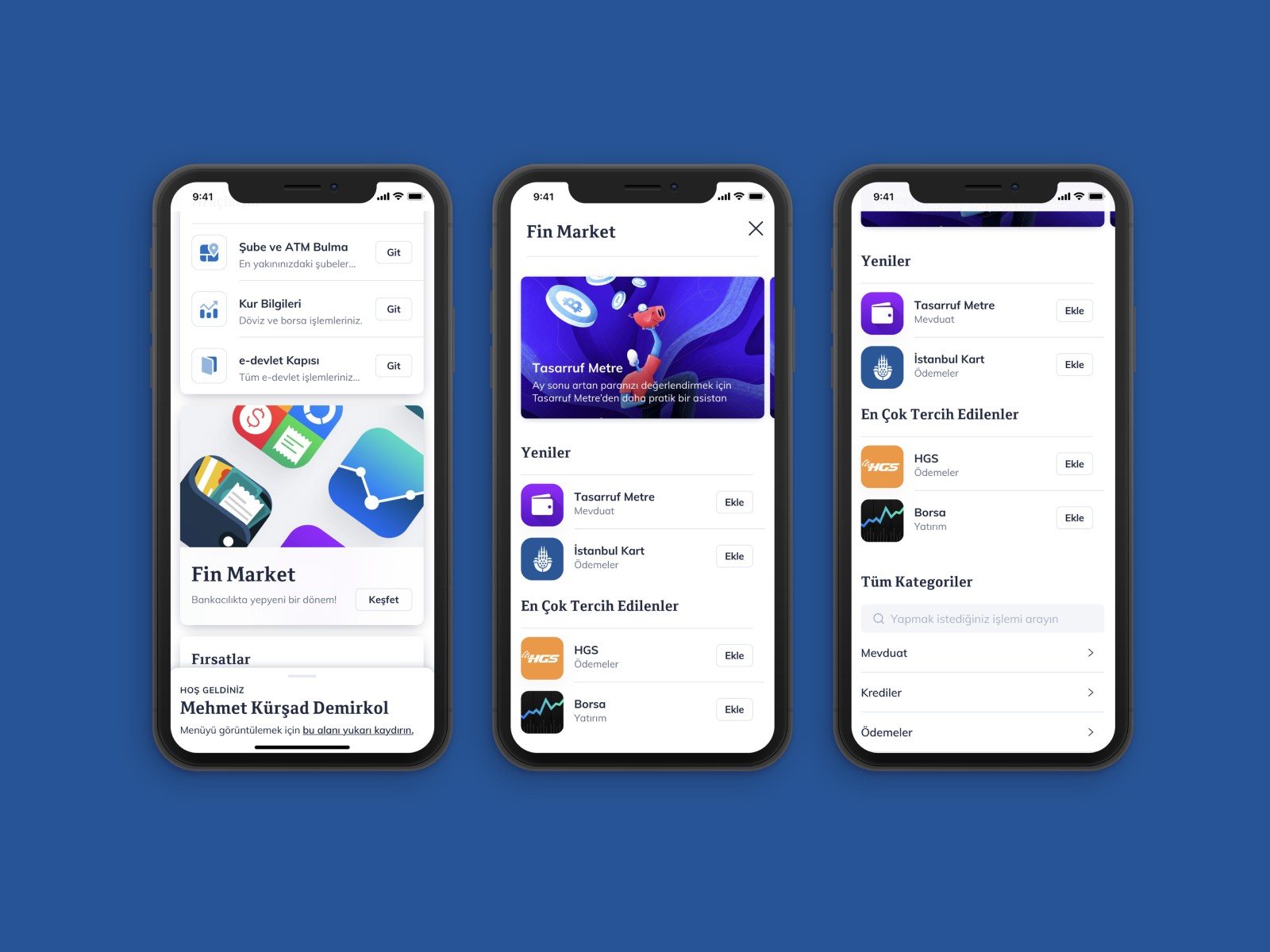
A redesigned app with 90+ transactions in a clean interface, built around three ideas.
05
Impact
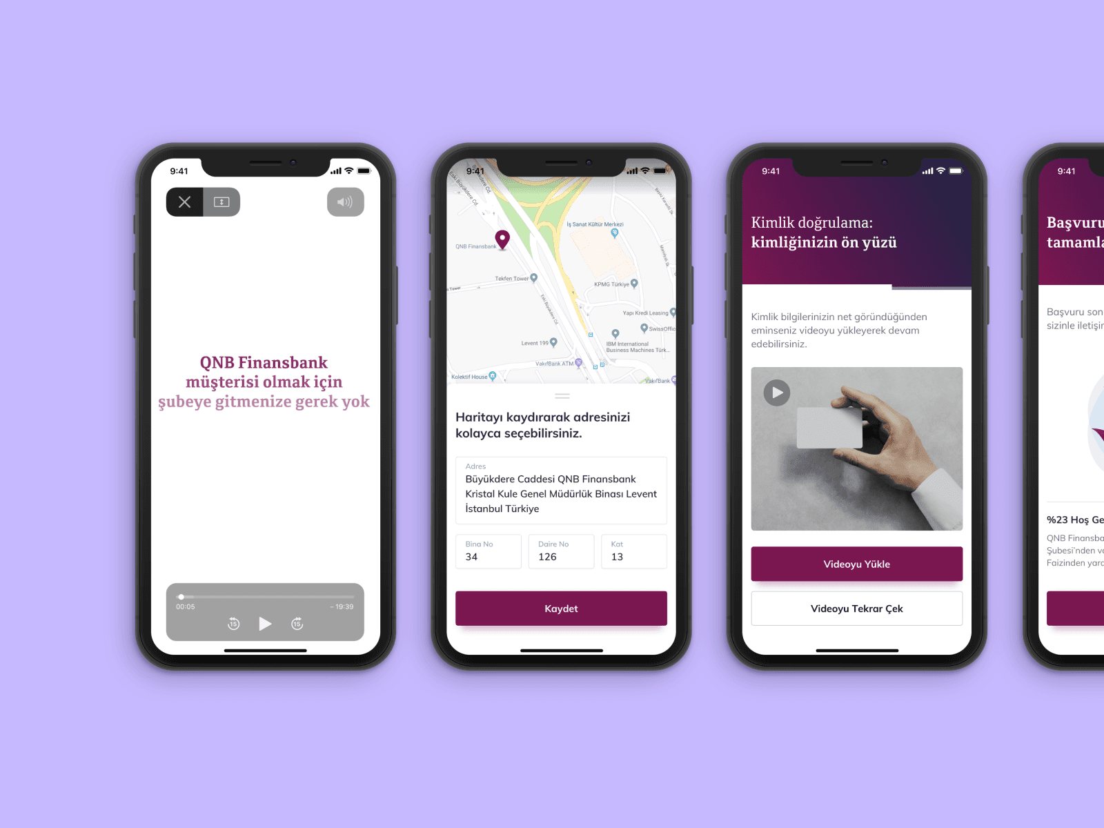
New customer acquisition increased by 70% in 3 months with the new digital channel, and the share of customers actively using mobile rose from 41% to 78%. The work received four Stevie Awards.
06
Takeaways
Co-creation builds trust
Bringing executives and teams into the workshop early turned stakeholders into co-authors of the direction.
Personas should shape the product
Designing the home page around real personas made one app feel relevant to very different customers.
Test before you polish
Usability testing on wireframe prototypes caught problems while they were still cheap to fix.
Connected Telco Services
Updated last, 2026.