
Case study04 · Firefly
Driver Companionturning daily trips into extra income
A four-week sprint to launch the app that lets rideshare and taxi drivers earn extra income by carrying mobile out-of-home ads on their trips, and gives them a reason to keep coming back.
01
Context
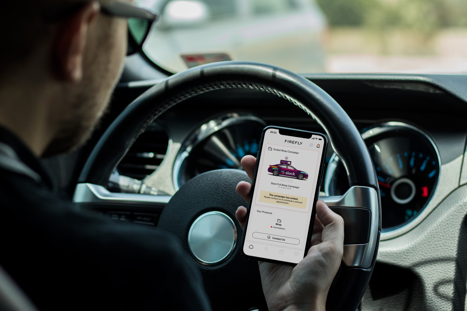
Firefly needed a driver-facing app to launch two things at once: a way for drivers to earn extra income by carrying mobile out-of-home ads on their trips, and a reason for them to stick around afterward.
New drivers dropped off during onboarding, and existing ones had nowhere to go for updates, servicing or support, just a gap where a product should have been. As the only product designer, I owned the process end to end, working alongside a design lead, a product owner and the development team.
02
The problem
Two different audiences needed two different things from one app.
The opportunitySolve both with the same product: an onboarding fast enough to convert, and a hub useful enough to keep people coming back.
03
Key decisions
Run discovery myself
I took part in the product owner's discussions and analysed industry benchmarks to understand current standards and capabilities, which also sparked ideas for where the app could stand out.
Structure before screens
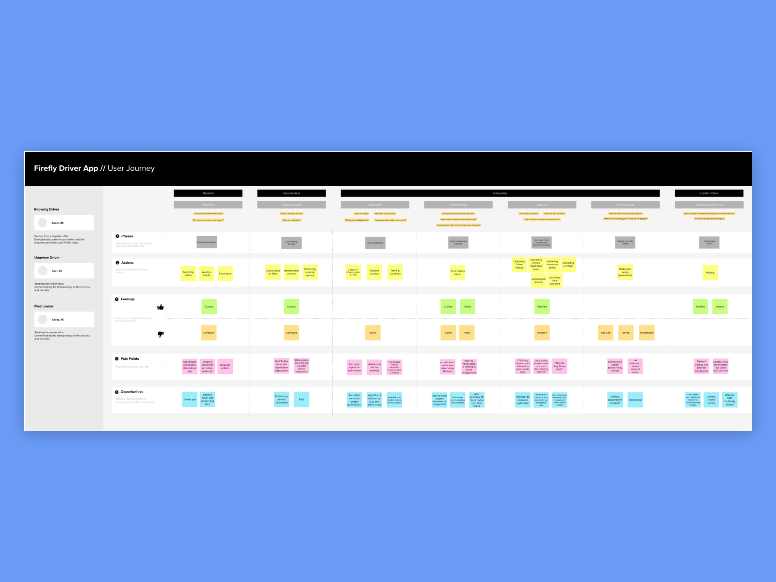
I designed a clear information architecture first. It also set the MVP scope by identifying the essential elements for launch. User flows and a user journey for the core features then made sure onboarding and the everyday hub shared one coherent structure.
Prototype with the developers, not for them
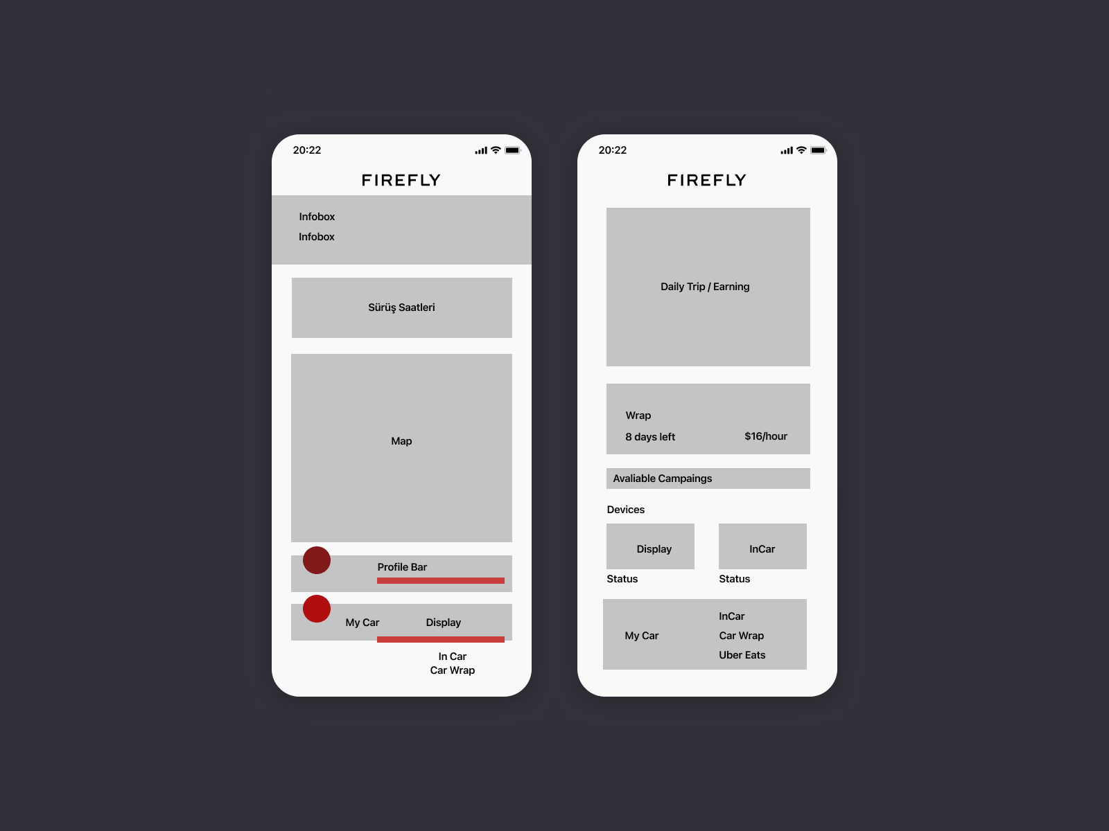
Wireframes moved quickly into prototypes built in close collaboration with the dev team, so every screen respected what iOS and Android could actually ship in the timeline.
A design language system early
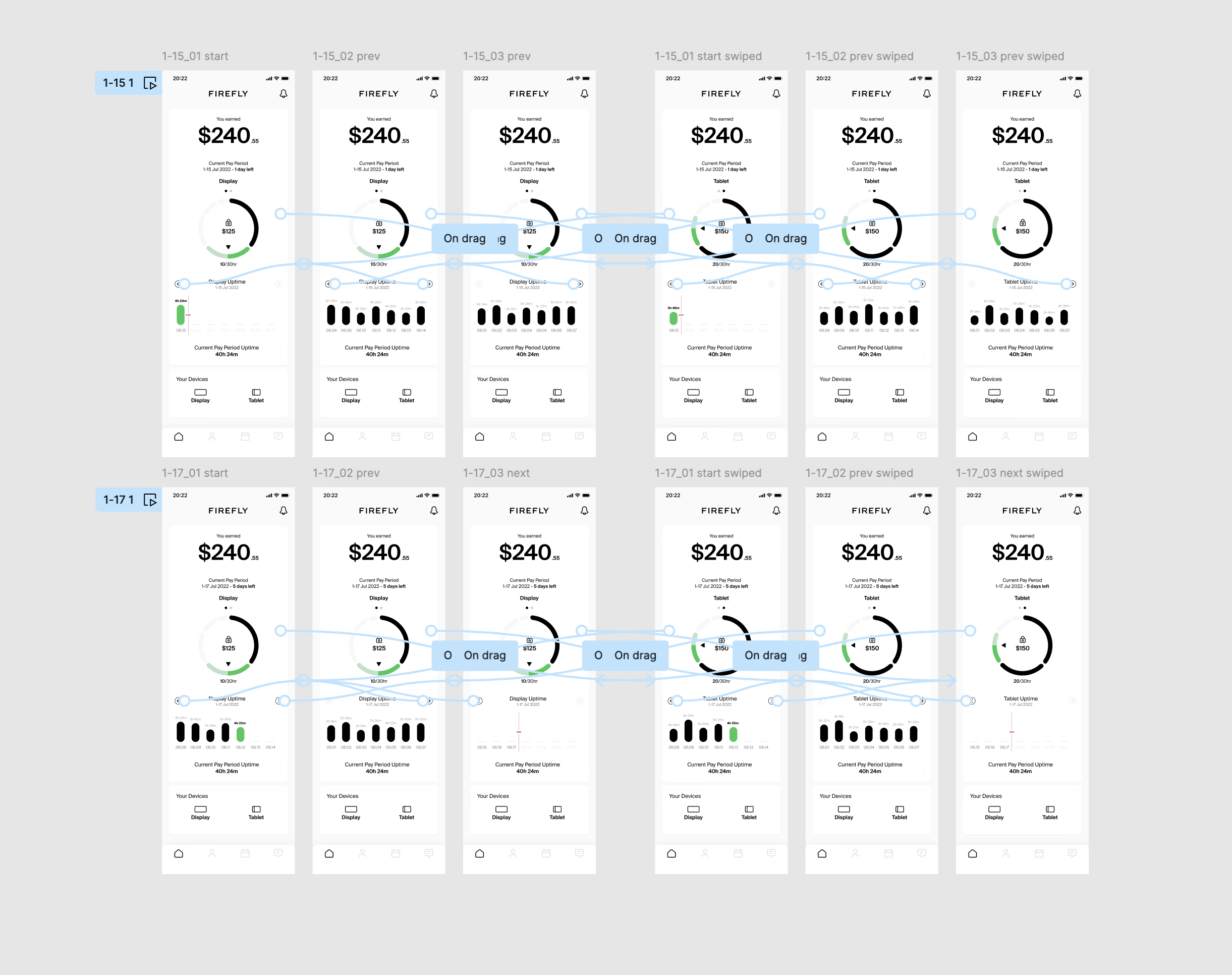
With four weeks on the clock, I set up the design language system first, so the team could move fast on the remaining screens without relitigating the same decisions twice.
04
The solution
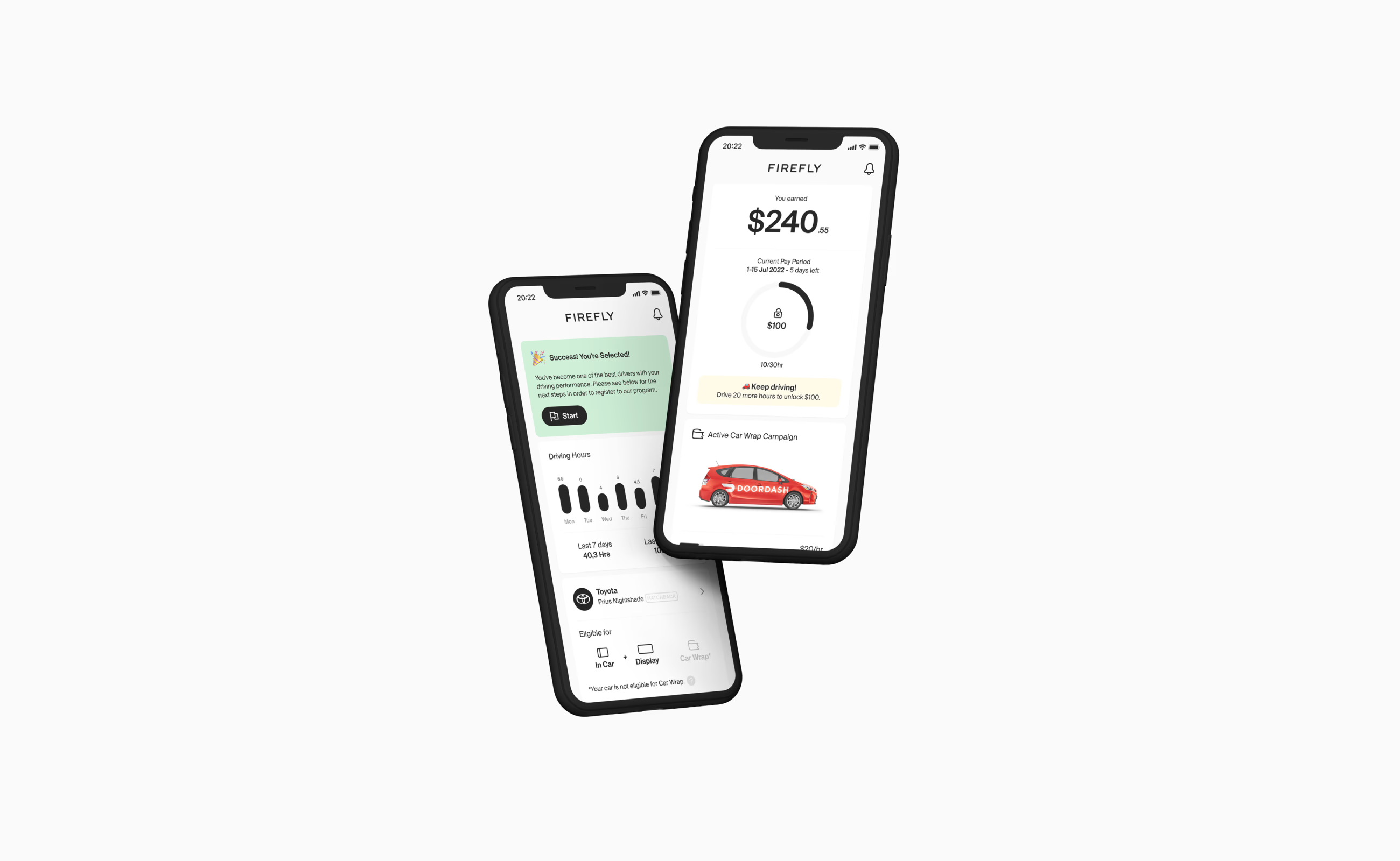
One app, two jobs: convert new drivers quickly and keep existing drivers engaged between trips.
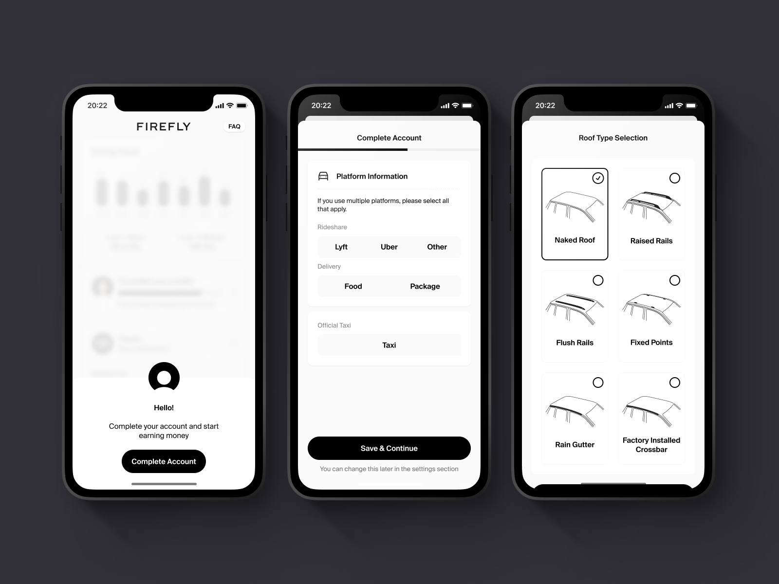
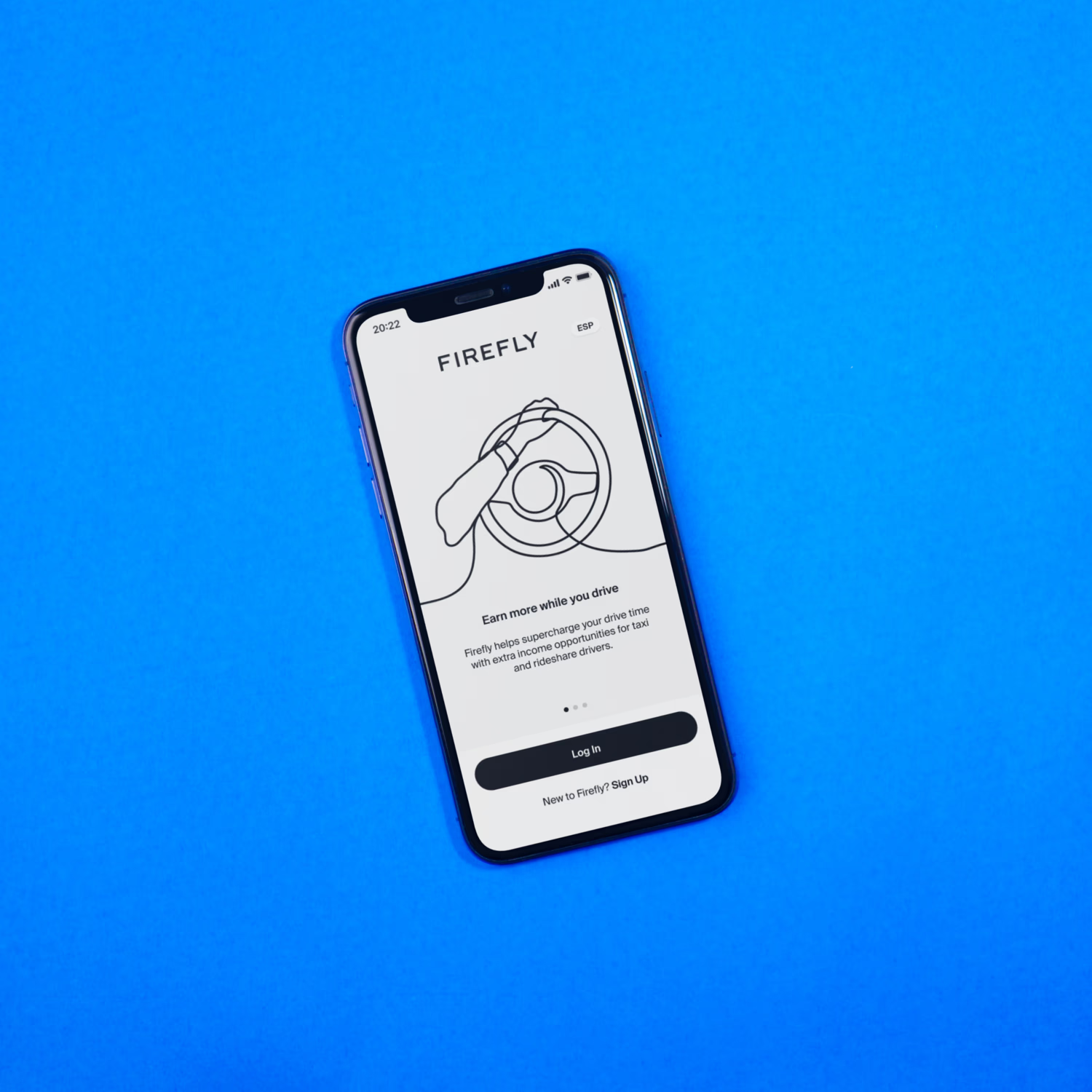
Onboarding that converts
AcquisitionA short, guided sign-up collects only what's needed (platform, vehicle and roof type) and confirms success clearly, so drivers get to earning without friction.
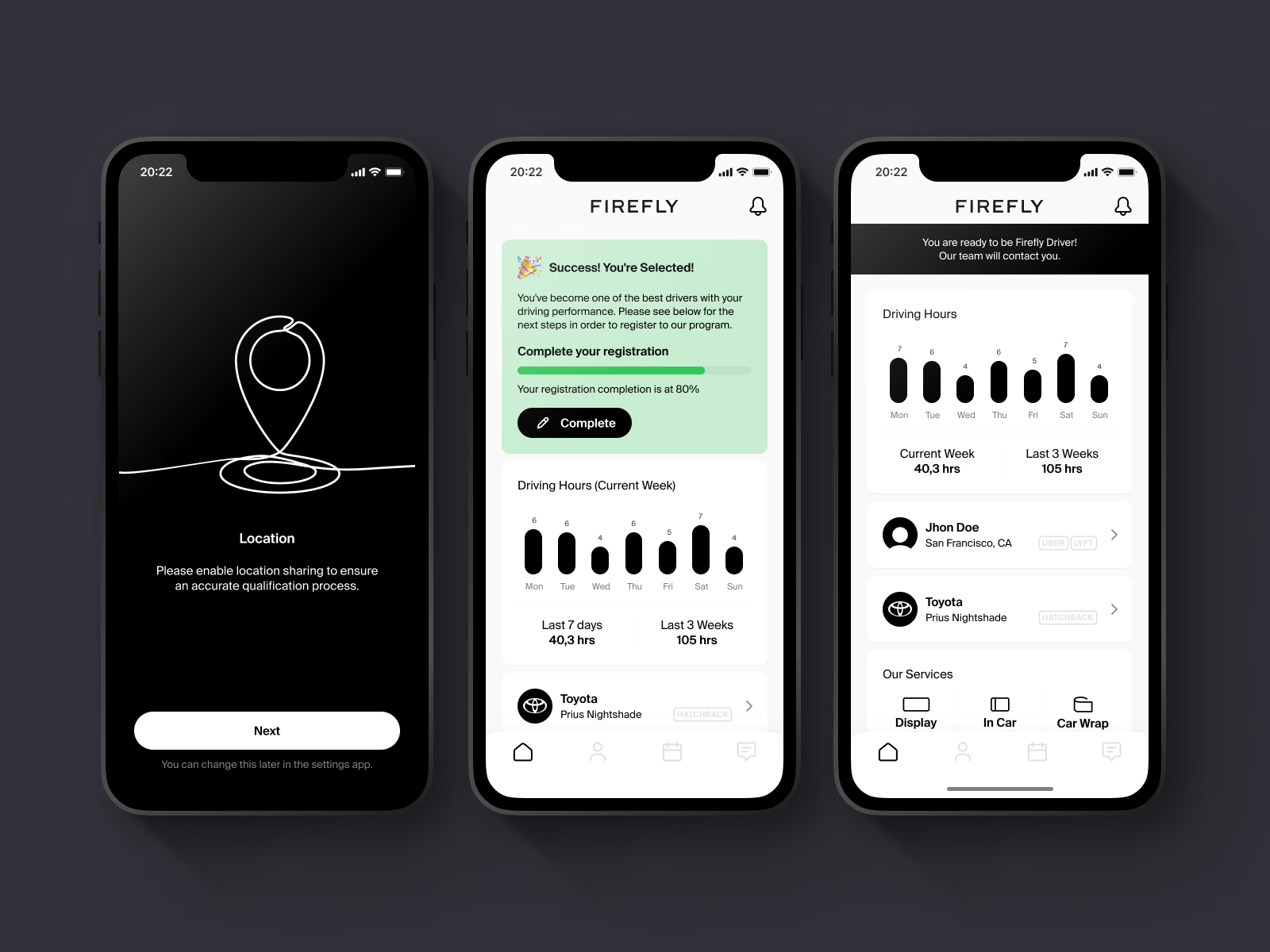
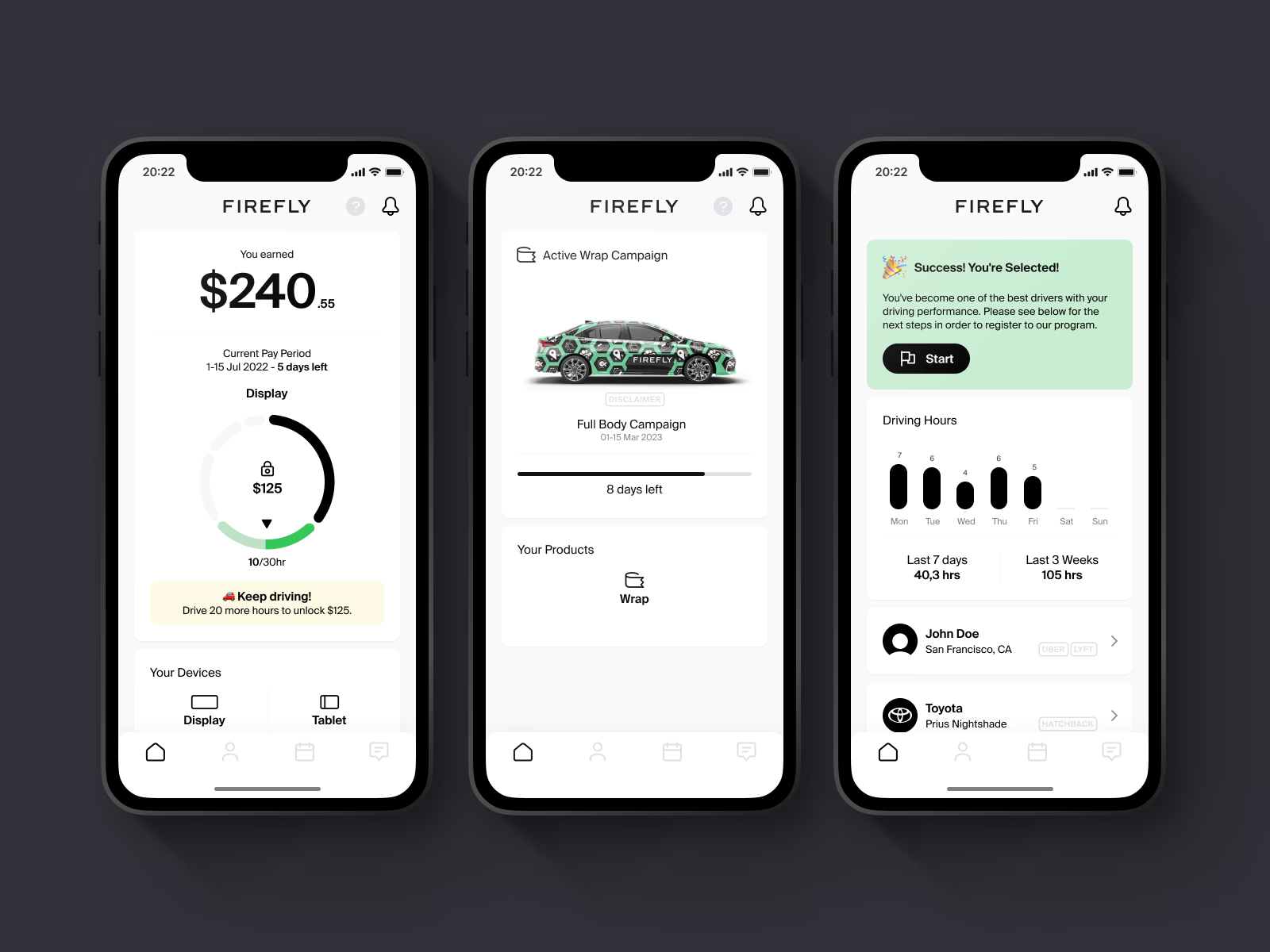
A hub worth coming back to
RetentionEarnings, active campaigns and driving hours sit on one home screen, together with devices and services, giving drivers a reason to open the app between trips.
05
Impact
More than 7,000 drivers registered in the first month across two markets. Returning drivers, the ones the retention half of the app was built for, drove 35% more hours than they had before.
06
Takeaways
One product can do two jobs
Treating acquisition and retention as separate design problems inside one app made both clearer to solve.
Systems first, especially under pressure
Setting up the design language system early was what made a four-week, two-platform MVP realistic.
Constraints are design input
Designing with the developers from the start kept every screen shippable and removed rework late in the sprint.
Digital Banking
Updated last, 2026.