
Case study02 · Proof of concept
Super App Ecosystemloyalty, banking and marketplace in one app
One of Turkey's largest retail companies wanted proof: could loyalty, banking and marketplace actually live under one app and talk to each other? In two weeks we turned a broad RFP into a coherent super app concept, an interactive prototype and a working demo, and the proposal was approved.
01
Context
The client handed us a detailed RFP covering a broad ecosystem: loyalty, financial services, marketplace capabilities and future partner integrations. The vision wasn't a single mobile product but a modular platform that could gradually evolve into a super app.
As the sole product designer in a pre-sales setting, I worked with two back-end developers, a front-end developer, a business analyst and an account manager, with design and development running in parallel from day one.
02
The problem
There wasn't really a design problem but a trust problem. The client didn't need another slide explaining what a super app could be. They needed to see, concretely, how loyalty points, banking flows and marketplace listings would integrate under one roof instead of sitting next to each other.
The opportunityWe were handed a handful of real user scenarios, and the opportunity was to let those scenarios do the explaining: connect loyalty, finance and marketplace so they feel like one product, not separate applications.
03
Key decisions
Start from what already works
I analysed the requirements to find the most important journeys, dependencies and product domains, ran rapid research on super apps, and reviewed insights from our previous financial products to reuse proven interaction patterns instead of starting from zero. With no digital brand guideline, I audited the brand's existing touchpoints to create a lightweight visual foundation.
One architecture, not three apps
With the business analyst, I translated a large set of functional requirements into a coherent product architecture: we mapped the main domains, prioritised the scenarios that best demonstrated the vision and defined how users move between them. I stayed aligned with the account manager to keep the experience focused on what mattered most for the proposal.
A shared navigation model and a lightweight design system
Rather than treating loyalty, banking and marketplace as independent modules, I designed them around a shared navigation model, with a lightweight UI foundation (colours, typography, spacing, components and interaction patterns) to keep the experience consistent. I used AI-assisted prototyping to turn finished designs into interactive end-to-end flows.
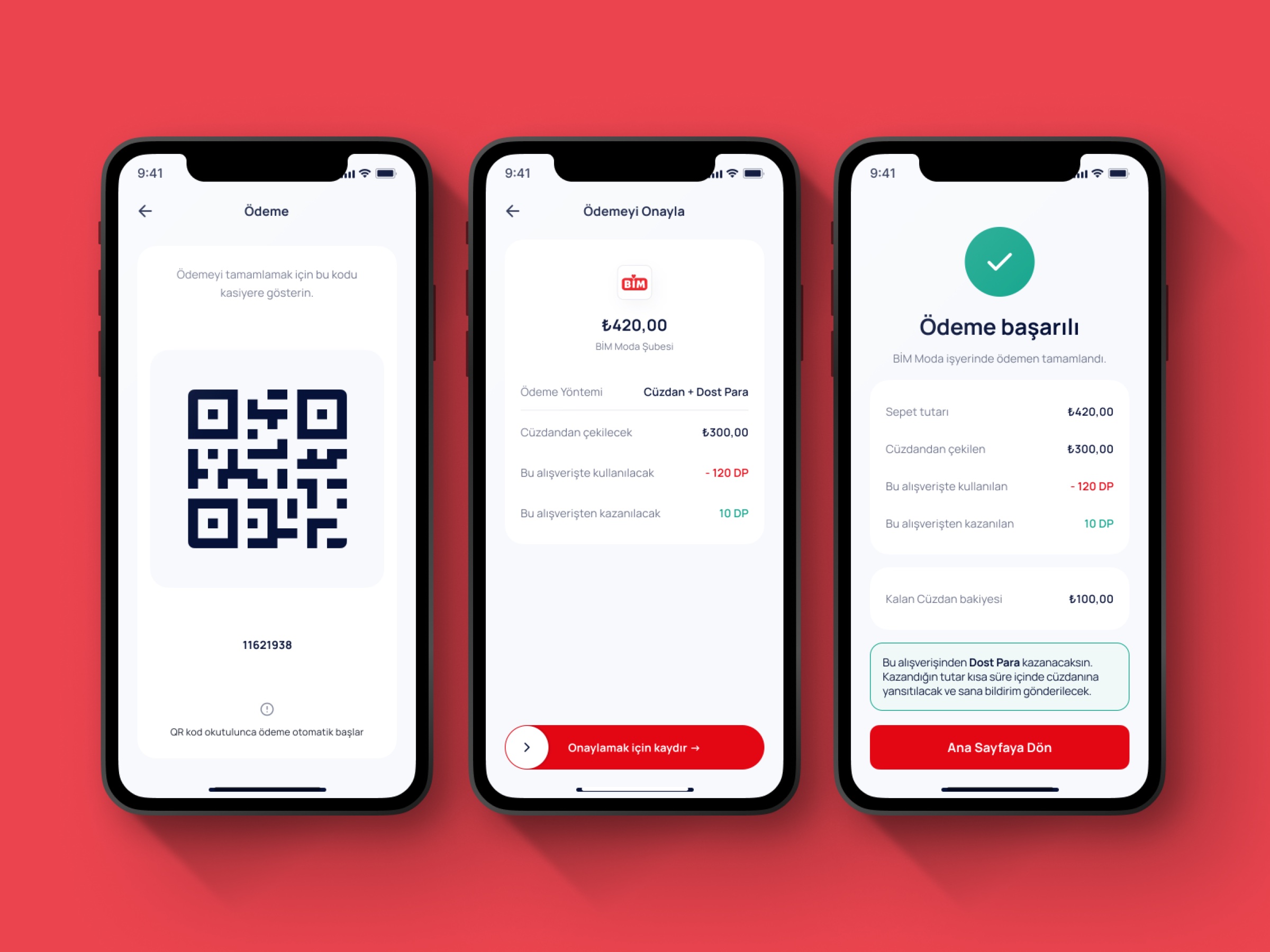
Design and development in parallel
As soon as a flow was stable, I reviewed feasibility, behaviour and constraints with the front-end and back-end developers. The AI prototype became a shared reference between design and development. In the second week my focus shifted to turning the experience into a functional demo, closing interaction gaps and preparing the product story I presented to the client.
04
The solution
A clickable narrative across a consumer app and a business web panel, told through the scenarios we were given.
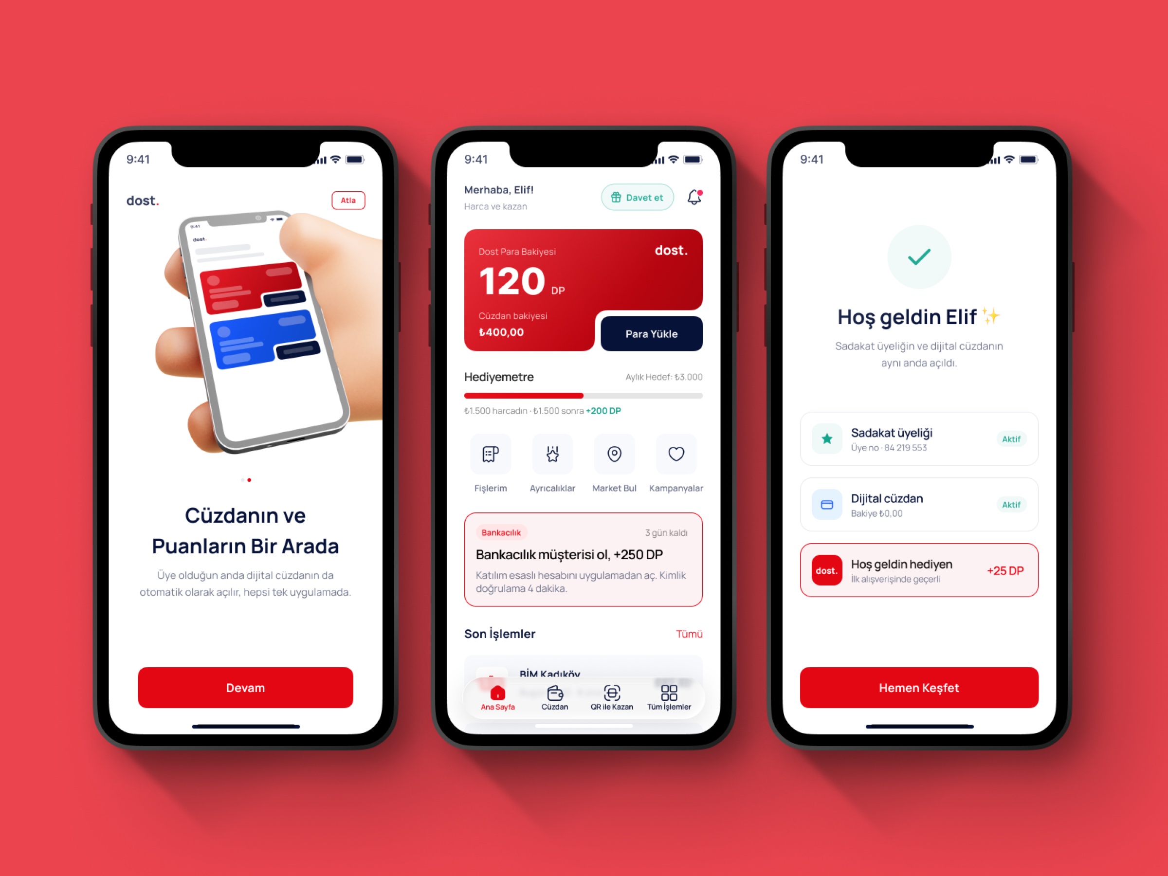
Join once, get everything
OnboardingA single sign-up opens the loyalty membership and the digital wallet together, with a welcome reward in points to show the ecosystem paying off from the first minute.
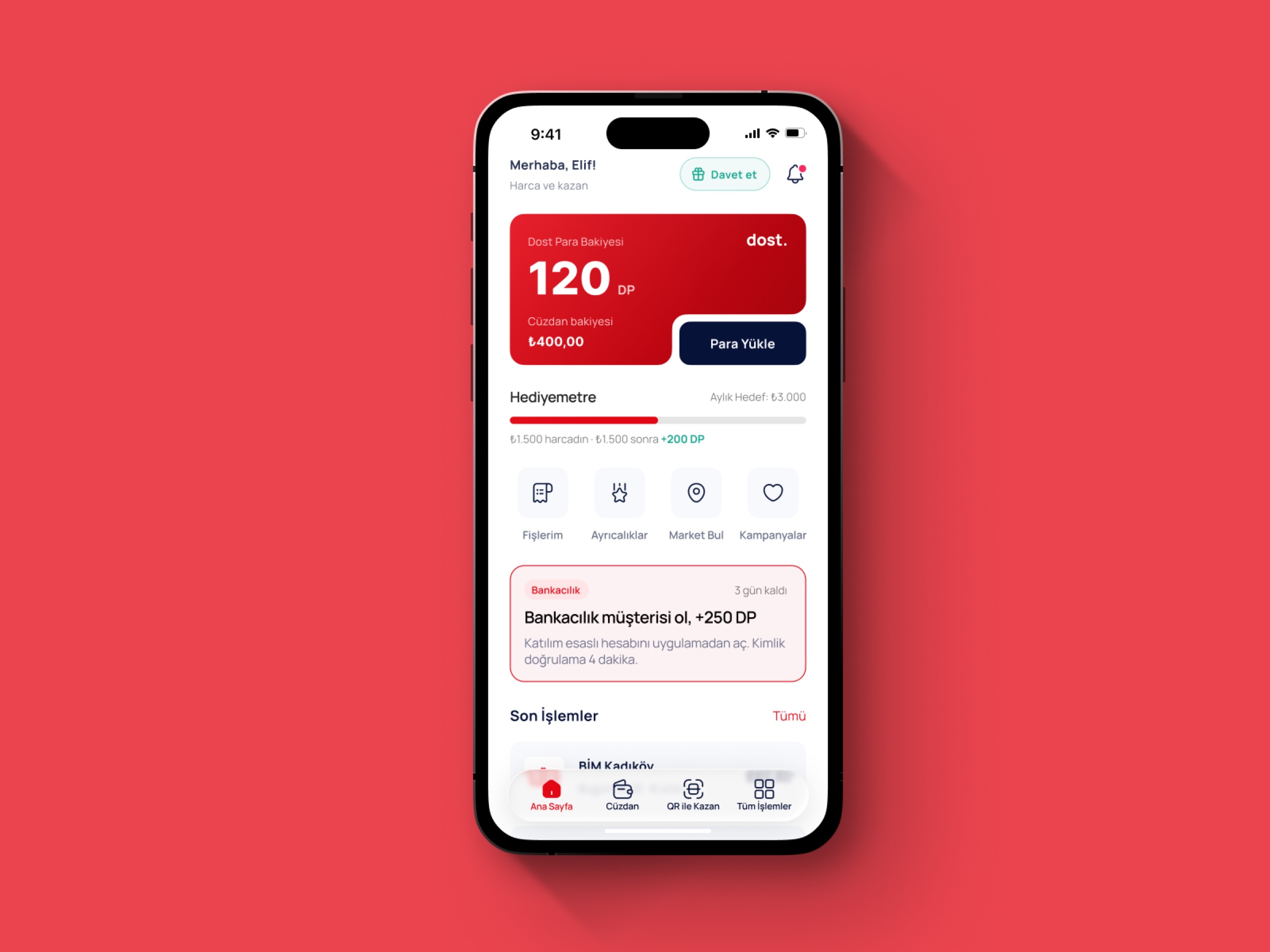
Banking inside the everyday app
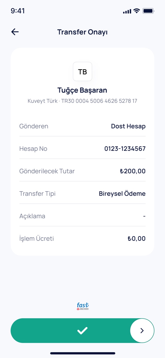
Home & paymentsThe home screen brings points balance, wallet and shortcuts together, and offers a bank account right where people already manage their money. Transfers run from the same app.
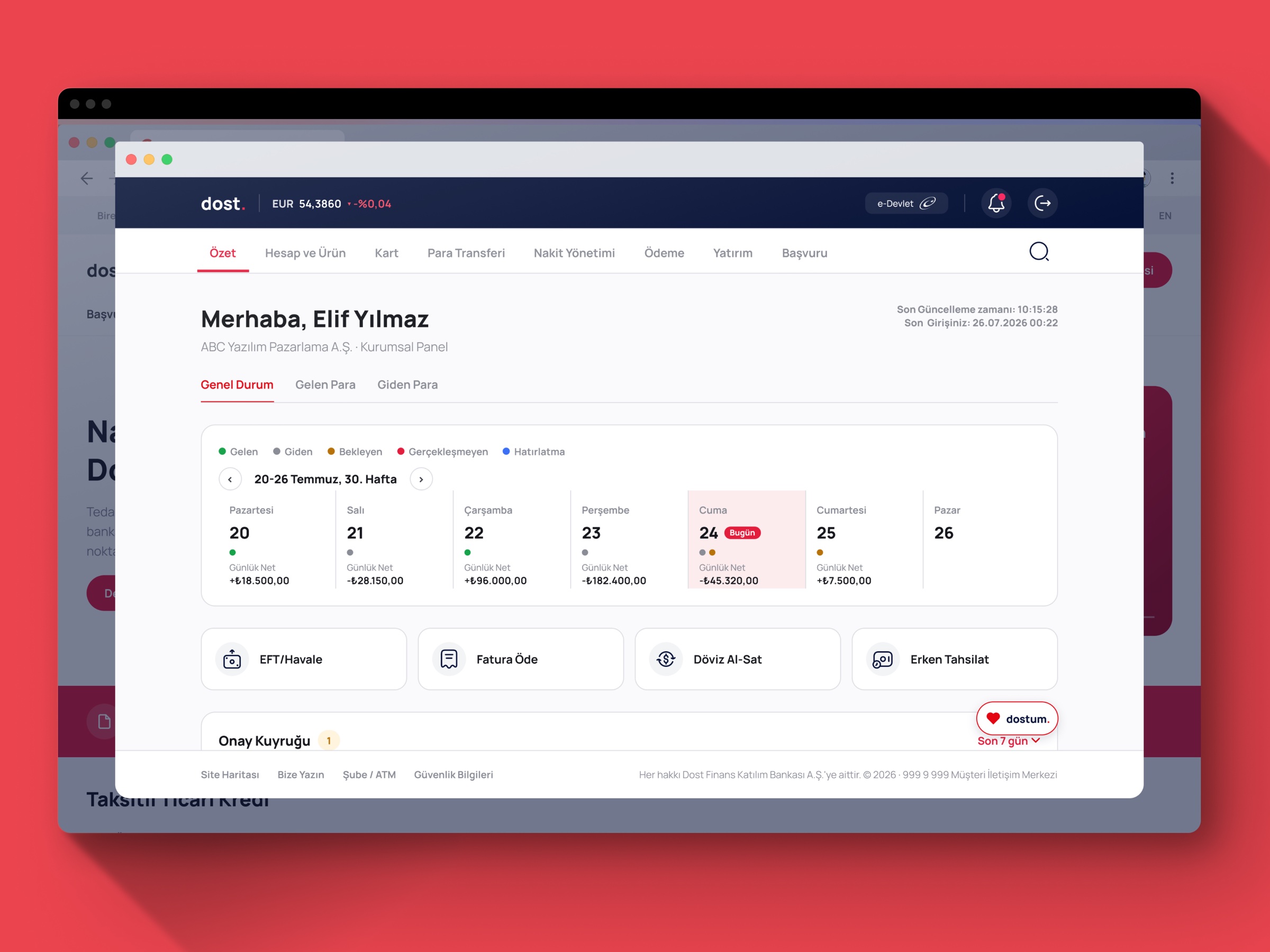
The business side
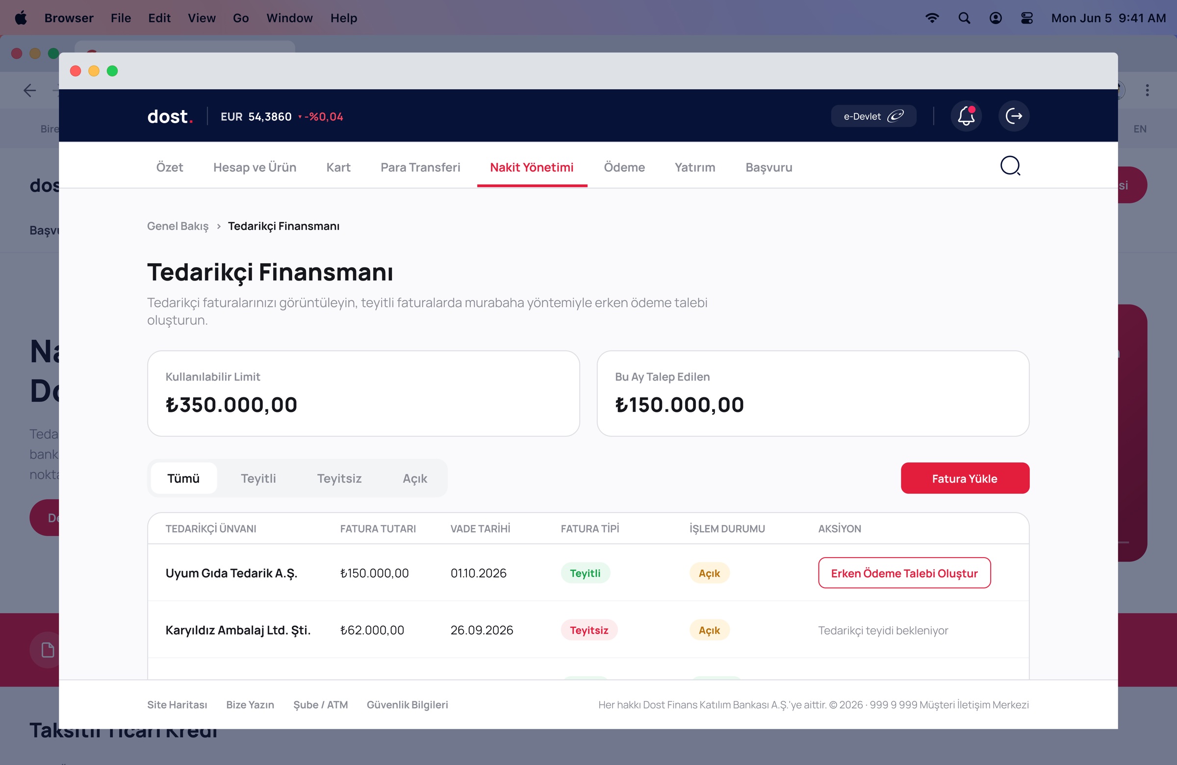
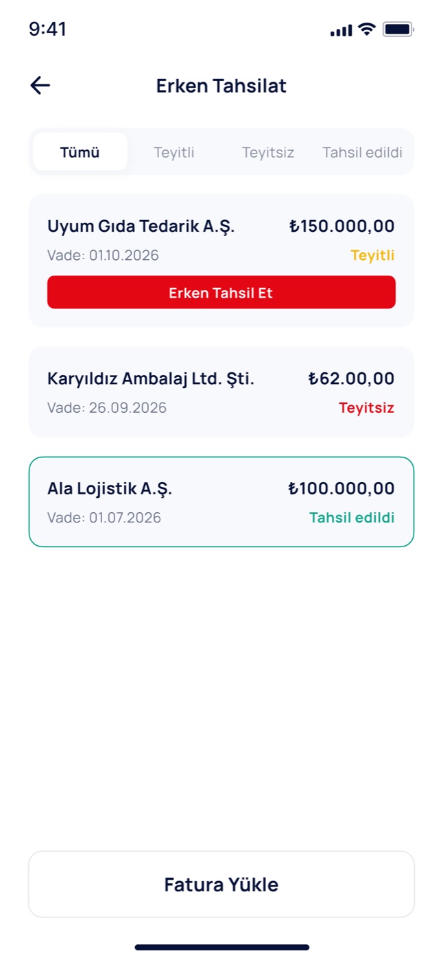
Web panelThe same ecosystem on the business side: a corporate web panel with a weekly cash-flow view, payments, supplier financing and early collection of receivables.
Flows in detail
Mobile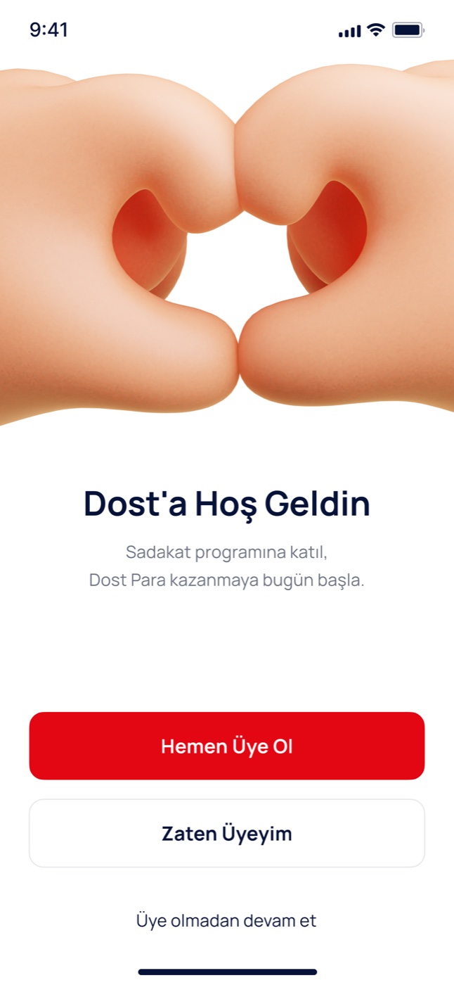
Prototype
InteractiveThe AI-assisted prototype, built with Claude Code, that we used as a shared reference with the developers and in the client demo. Click through it below.
05
Impact
In just two weeks, we transformed a broad set of business and functional requirements into a coherent super app concept, an interactive prototype and a working demo, connecting loyalty, finance and marketplace journeys within a single product vision.
I demonstrated the key flows to the client using both the working application and the interactive prototype, explained the design decisions and answered product and UX questions. Following the presentation, the proposal was approved and the project moved forward.
06
Takeaways
Proof beats pitch
When the real question is trust, a working story convinces faster than any explanation of the vision.
Scenarios over architecture
Walking stakeholders through one user's day made a complex integration understandable to everyone in the room, not just engineers.
Design with engineers from day one
Running design and development in parallel, with the prototype as a shared reference, kept a two-week sprint honest and every screen buildable.
Supply & AdOps Hub
Updated last, 2026.